
Partilhas Association
Brand Illustration System
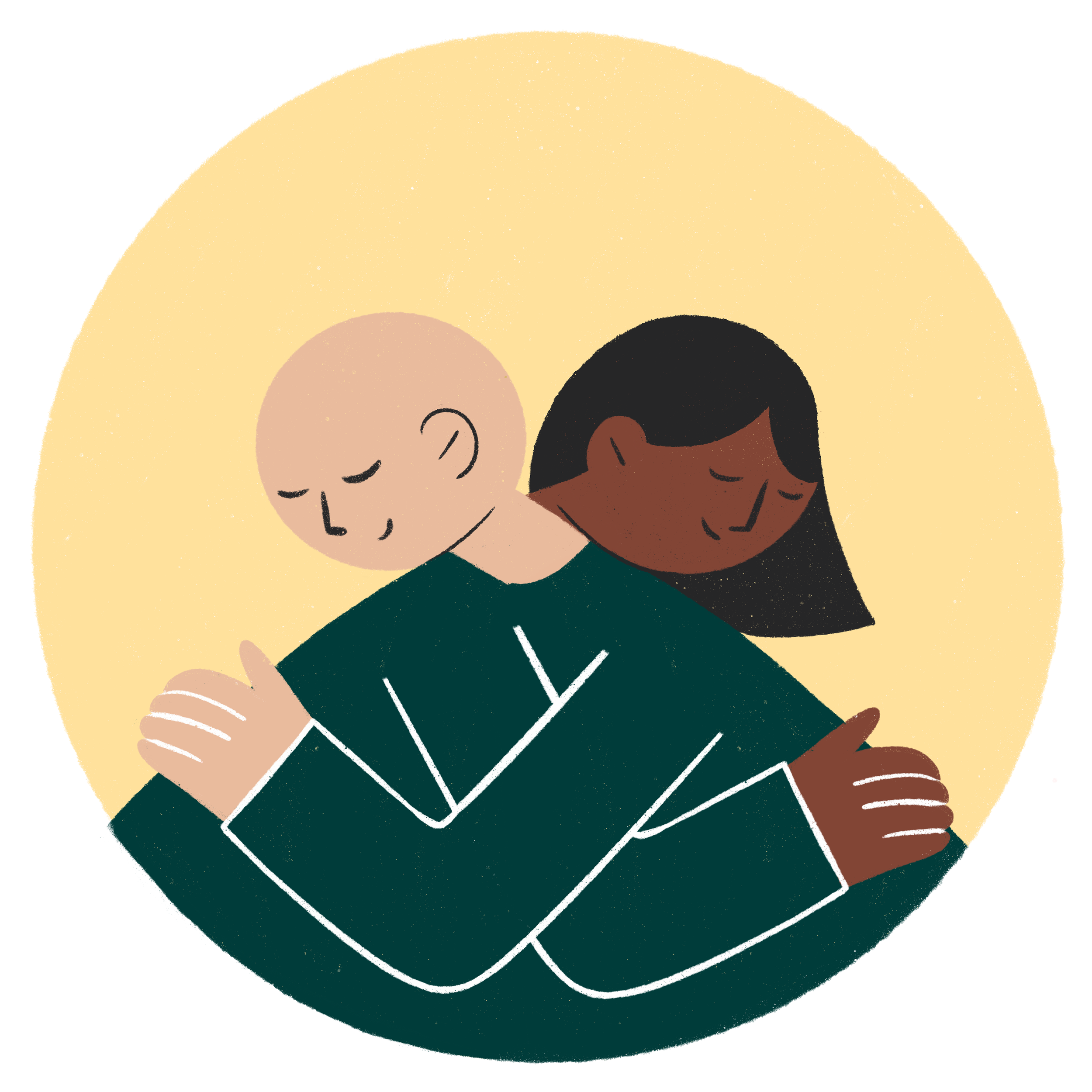
Partilhas is a nonprofit that supports people living with cancer. Their mission is to humanize healthcare through closer, more compassionate care.
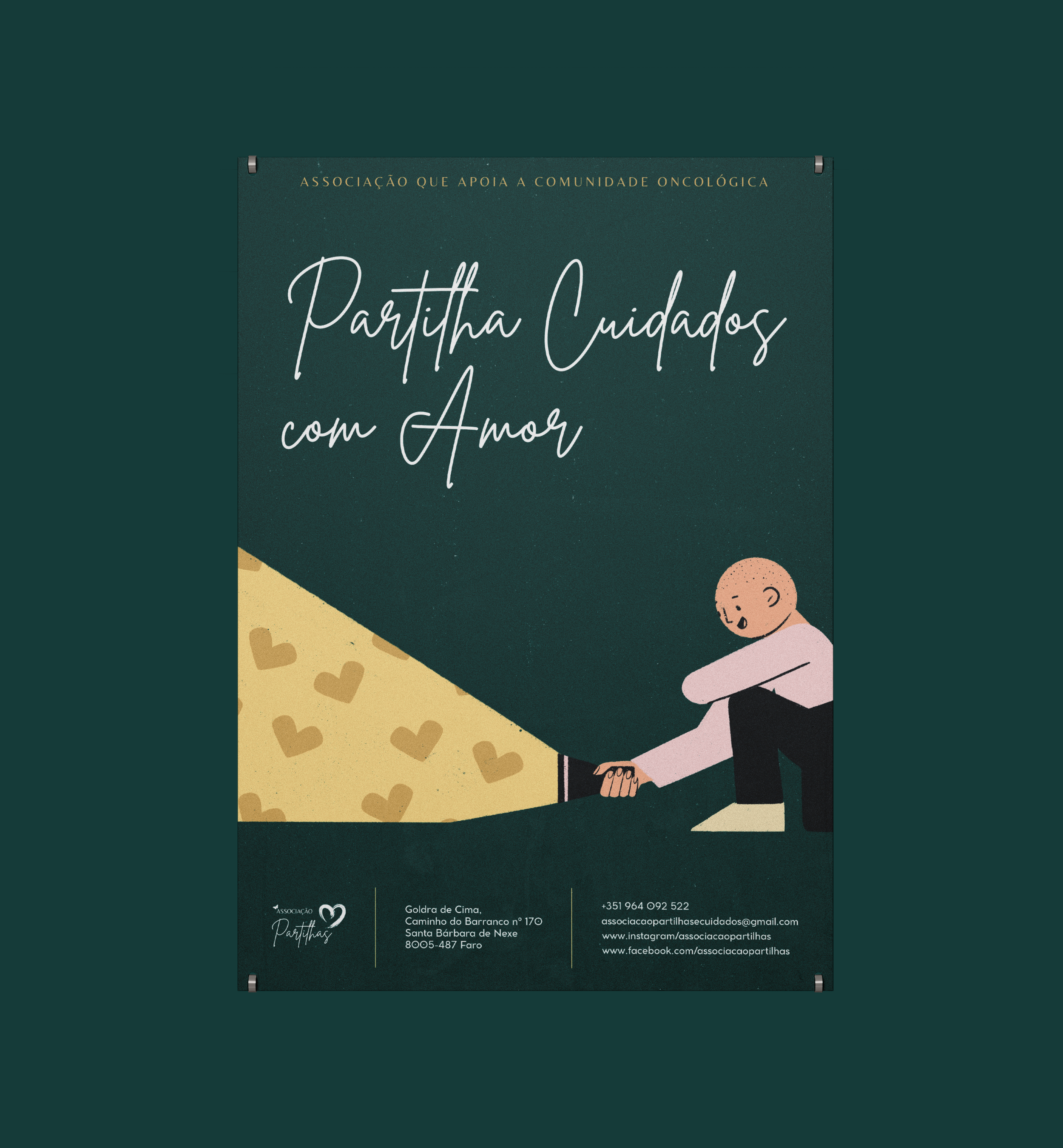
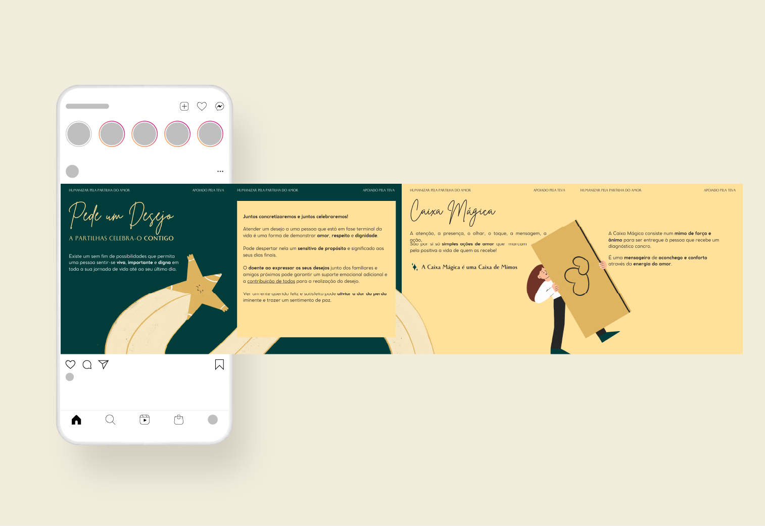
They approached me to develop illustrations that could support new initiatives — but the brief quickly expanded. What started as a need for a few visuals evolved into the development of a full illustration system. From digital to print, the work needed to feel consistent and intentional — reinforcing their values across every touchpoint without losing emotional clarity.
Client
Partilhas Association
Role:
Art Direction | Illustration


Approach:
To land the right tone, I immersed myself in their mission, services, and language. The direction needed to be joyful but grounded — expressive enough to connect with people, but clear enough to carry meaning across age, gender, and context.
The visual solution emphasized warmth and proximity. I broadened the color palette to support better gender inclusivity and focused each illustration on service-led scenes, supported by soft visual flourishes to reflect care, without diluting clarity.
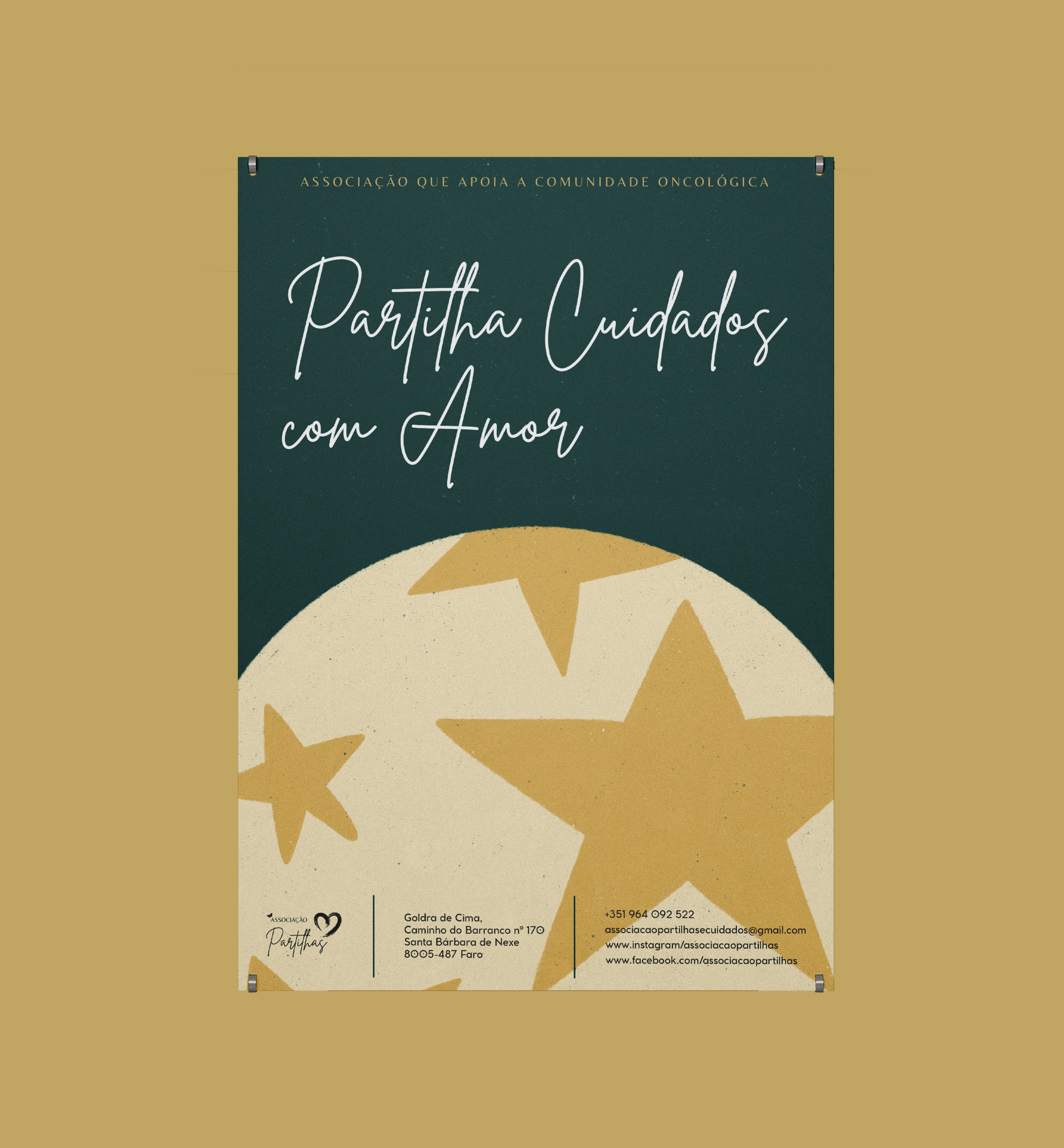
To ensure flexibility, every illustration was delivered in multiple color variations and with and without background elements — giving the team options to adapt seamlessly across different formats, platforms, and communications.


The new illustration system brings humanity and structure to the brand. Each piece reinforces what Partilhas stands for — proximity, empathy, and thoughtful care — helping them build deeper recognition and trust within their community.


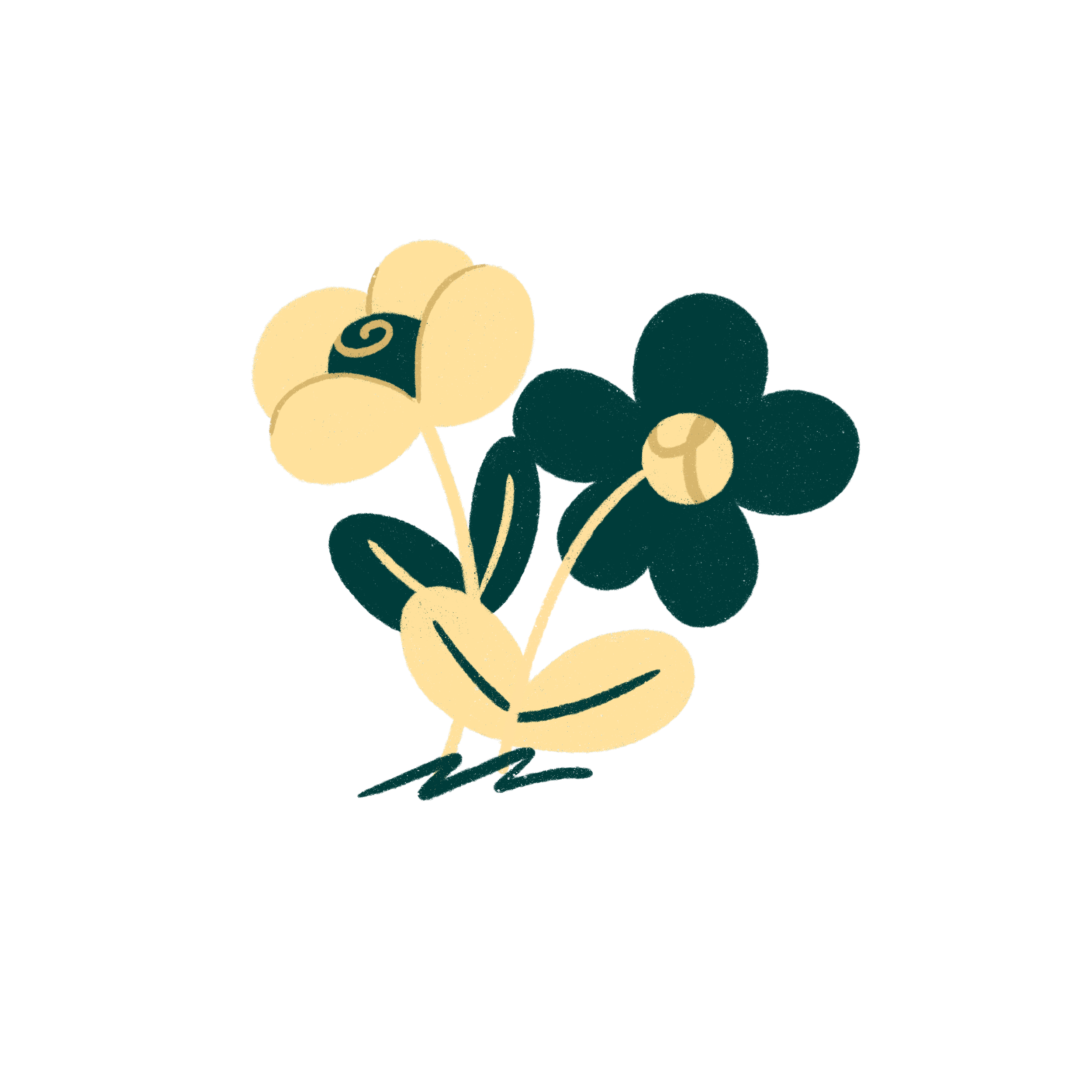
Small Elements


Sandra Matinhos
Associação Partilhas e Cuidados
President and Founder
“Working with Inês has never been just about design — it's about translating our values into something people can feel.”
Her illustrations bring warmth, clarity, and consistency to everything we do. They’ve helped us reach further, connect deeper, and communicate more honestly. What she created wasn’t just visual — it was structural. It gave our mission a voice.