
Nervy Design
Brand Animation
Challenge:
Nervy approached me with a clear objective: bring their five brand values to life on their homepage through a bold, expressive animation. They wanted something evocative, not decorative.
The output needed to reflect their editorial identity: bold, black-and-white, type-forward, and sharp in tone.
Role:
Art Direction | Illustration | Animation
I led the creative from end to end — from initial storyboarding and visual development to final animation and asset delivery. Nervy shared early references, and I co–art directed the final direction to ensure it aligned closely with their tone and ambition.
Alongside the animation, I delivered a set of stills for use across their digital platforms — maintaining consistency while extending the reach of the core concept.

The animation now anchors Nervy’s homepage — a bold, values-led introduction to their studio.
Built to clearly communicate who they are and what they stand for.

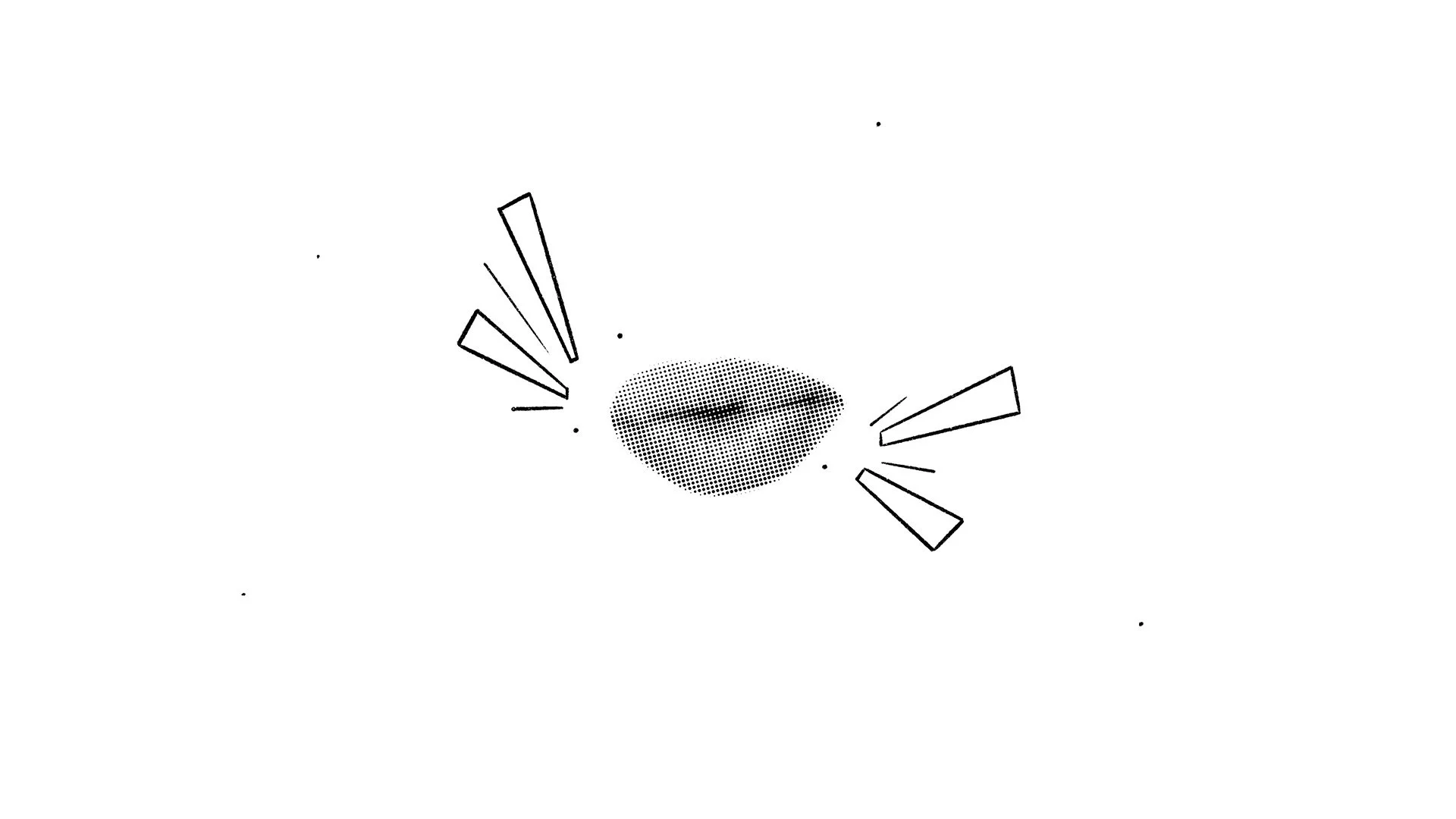
Approach
Each brand value was treated as a distinct personality, with its own visual tone, pacing, and movement style. This contrast helped emphasize the individuality behind each principle. The recurring “Be” acted as the cohesive thread throughout, designed to hit hard with rhythm and intent, anchoring the sequence in structure while allowing space for creative shifts.

