
Para Além do Cancro
Brand and Product Development
It all started with a familiar ask: “We need some illustrations....” But during our first conversations, it became clear that the scope was much bigger — not just a product, but a platform. What they actually needed was a brand that could grow with them, built to support a future ecosystem of products — and the structure and creative support to bring their first product to life.
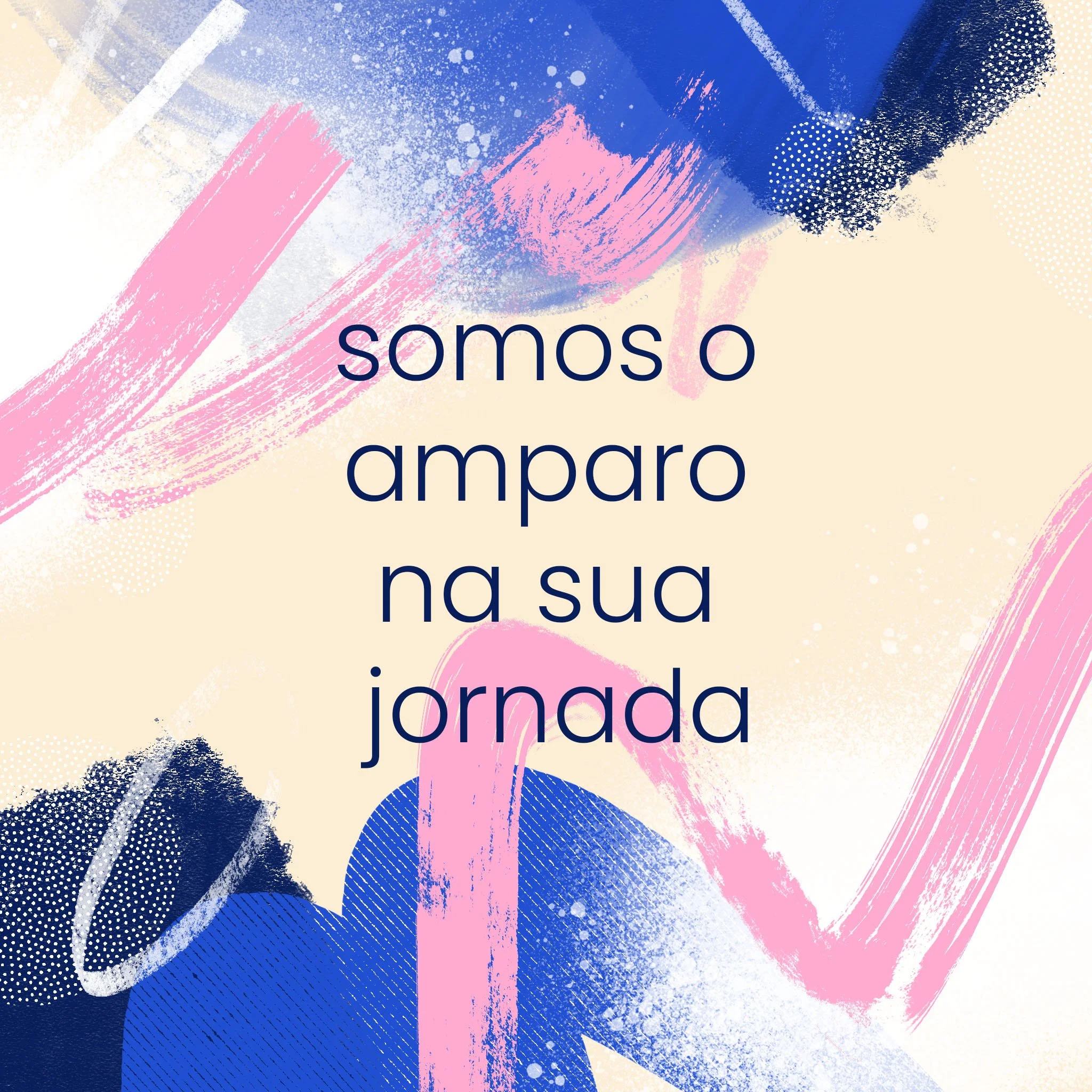
Para Além do Cancro is a health brand created to support people living with and beyond cancer. Its mission is to bring emotional clarity, beauty, and humanity into the lived experience of illness — through tools that inform, soothe, and uplift.
The challenge was to build a brand that could carry this emotional weight with care and clarity — across products, guides, communication, and campaigns. The team needed a system that felt soft but structured, consistent but flexible, and above all, human.
I was brought on to lead the creative direction across every touchpoint: from brand development, product design, and product development to illustration, visual systems, and coordination across teams — including marketing, scriptwriting, layout design, and production.
Client
PADC
Role:
Branding
Product development
Illustration system
Creative direction & team coordination
Communication and campaign collateral design
Approach:
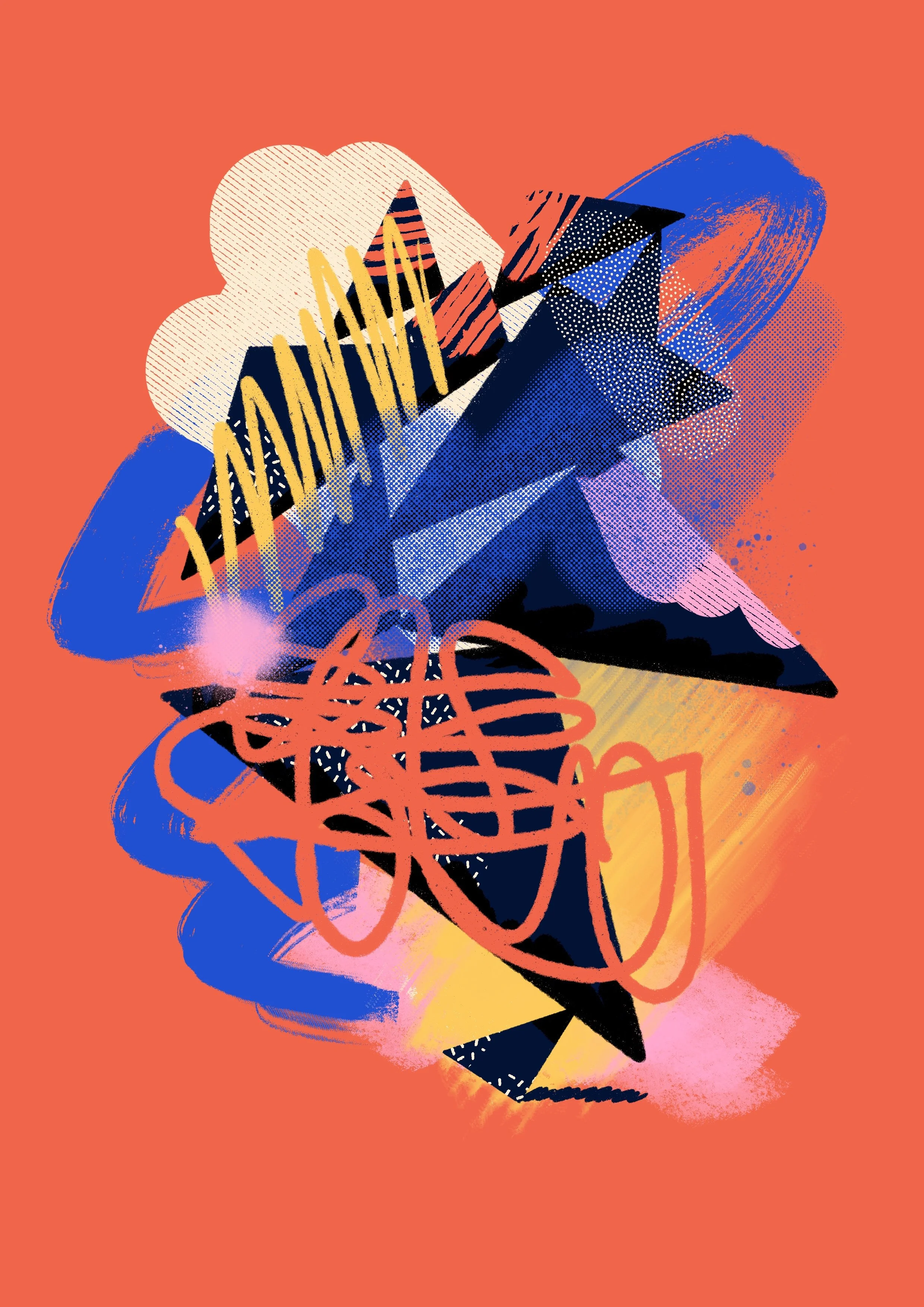
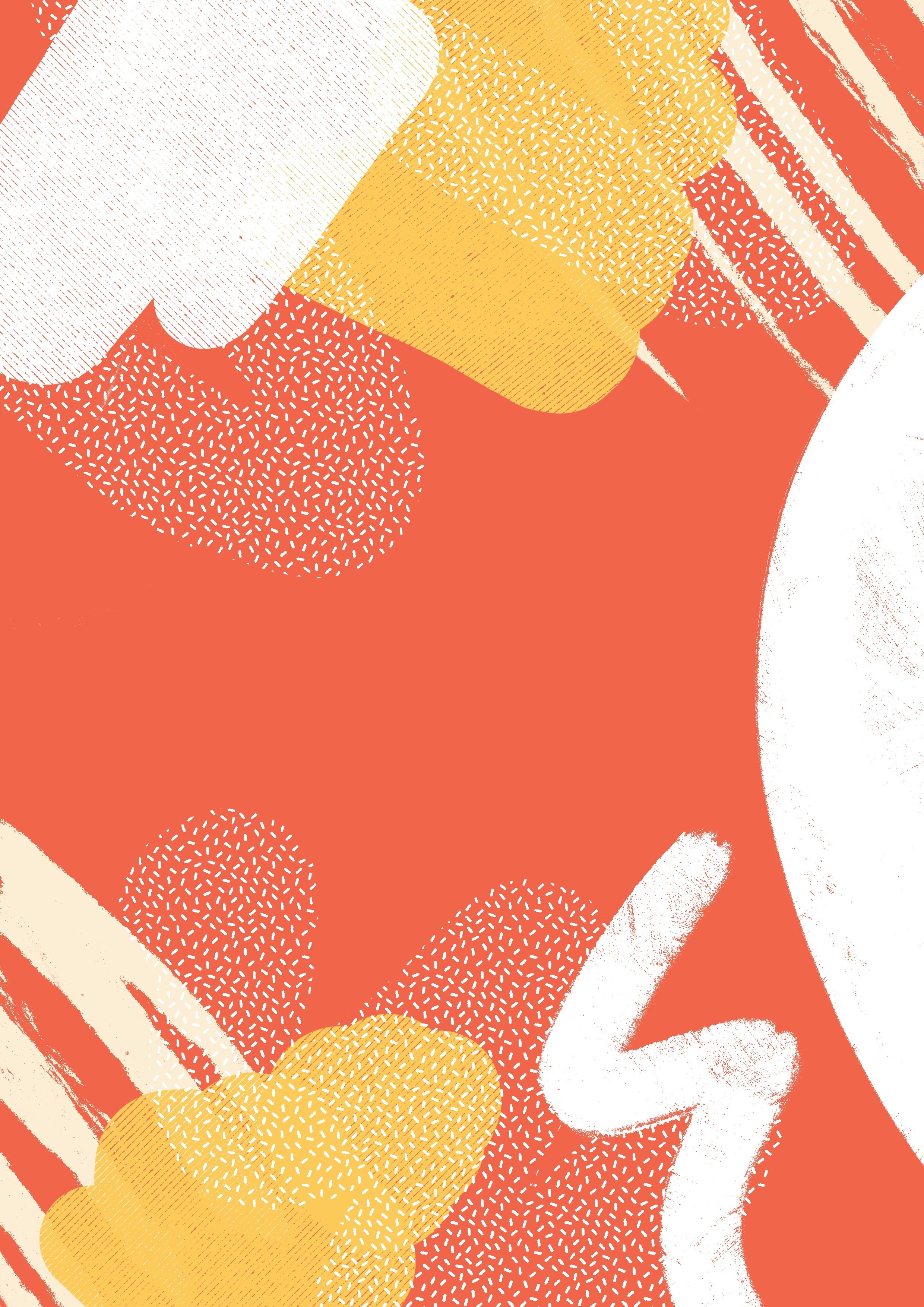
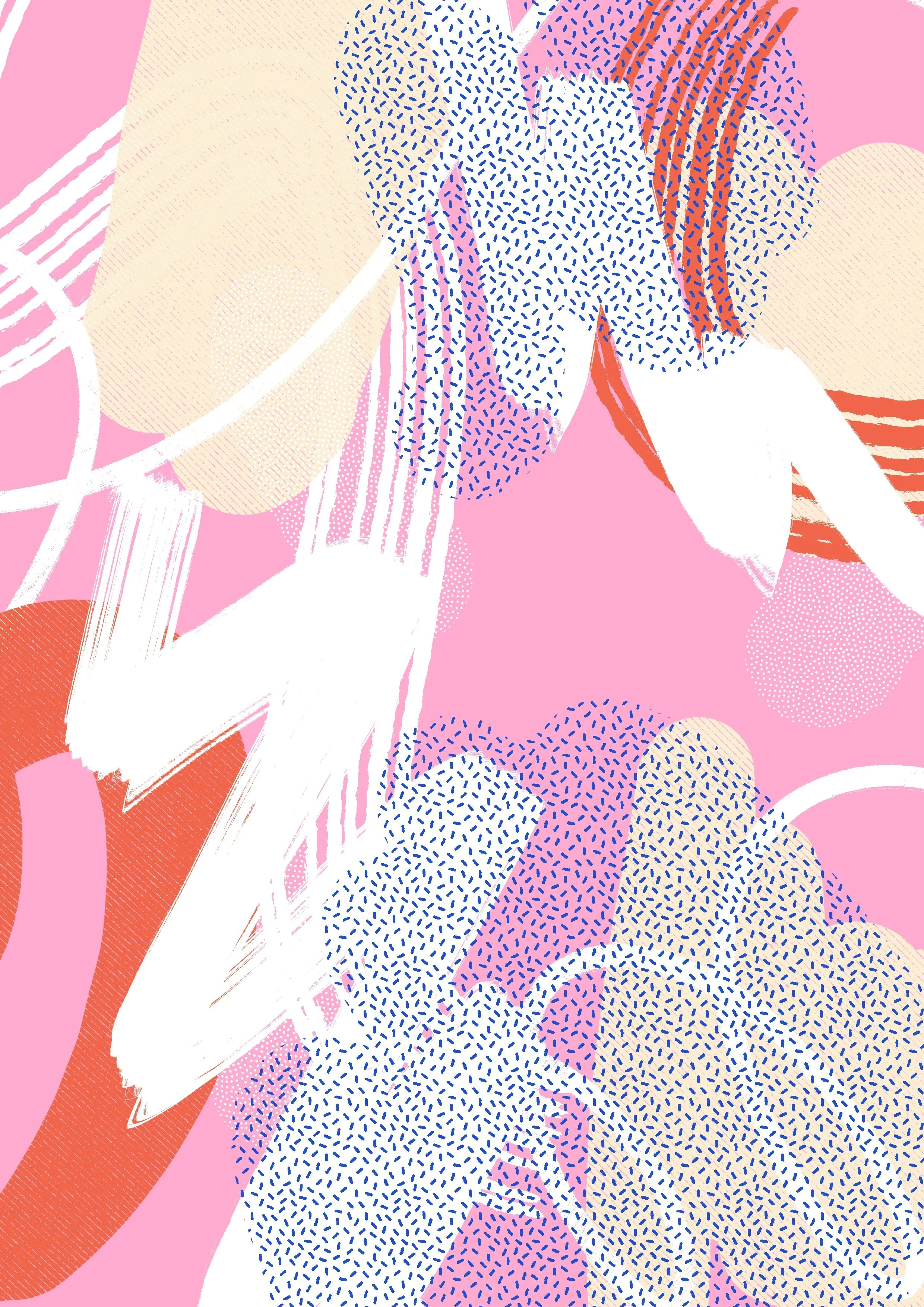
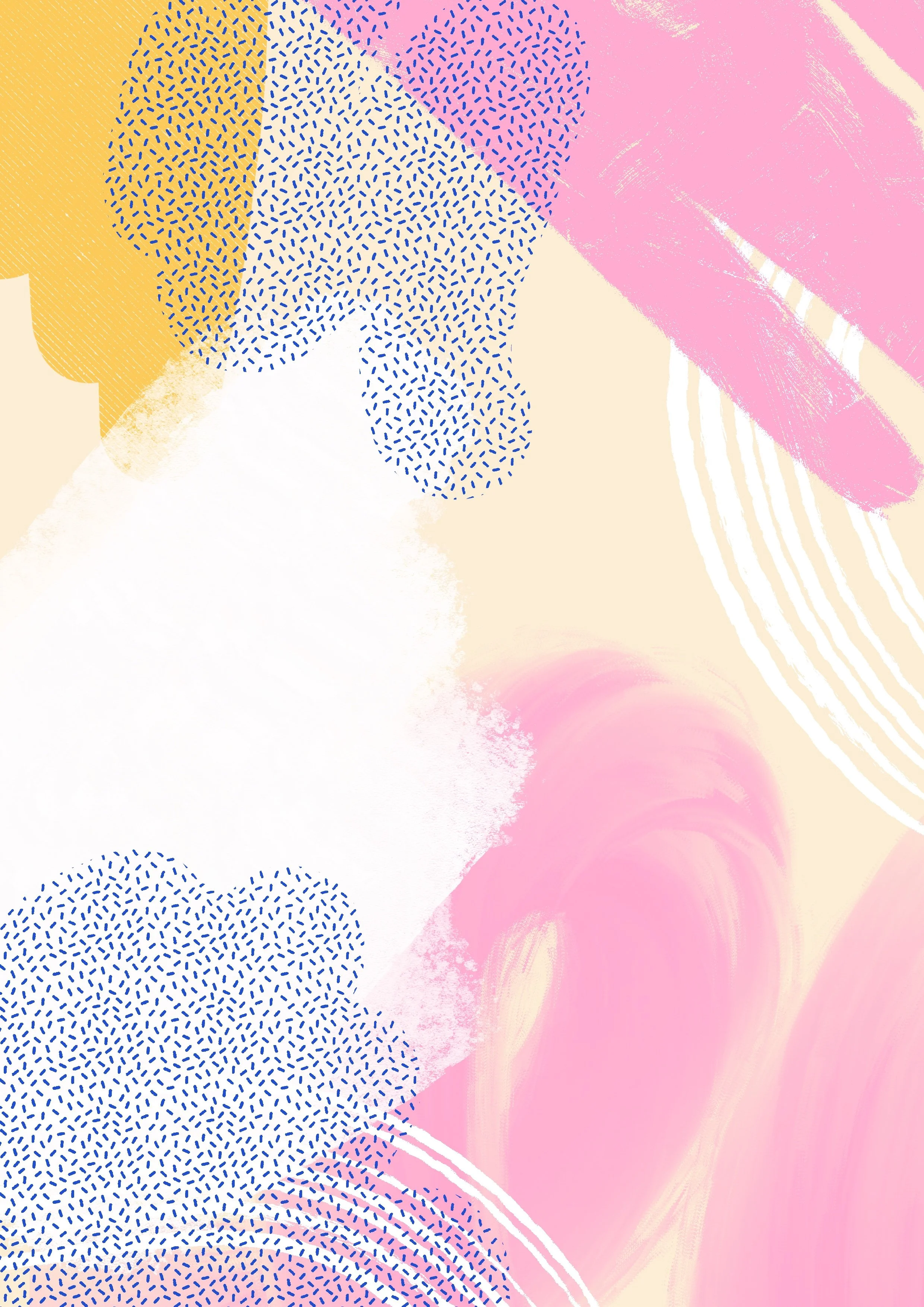
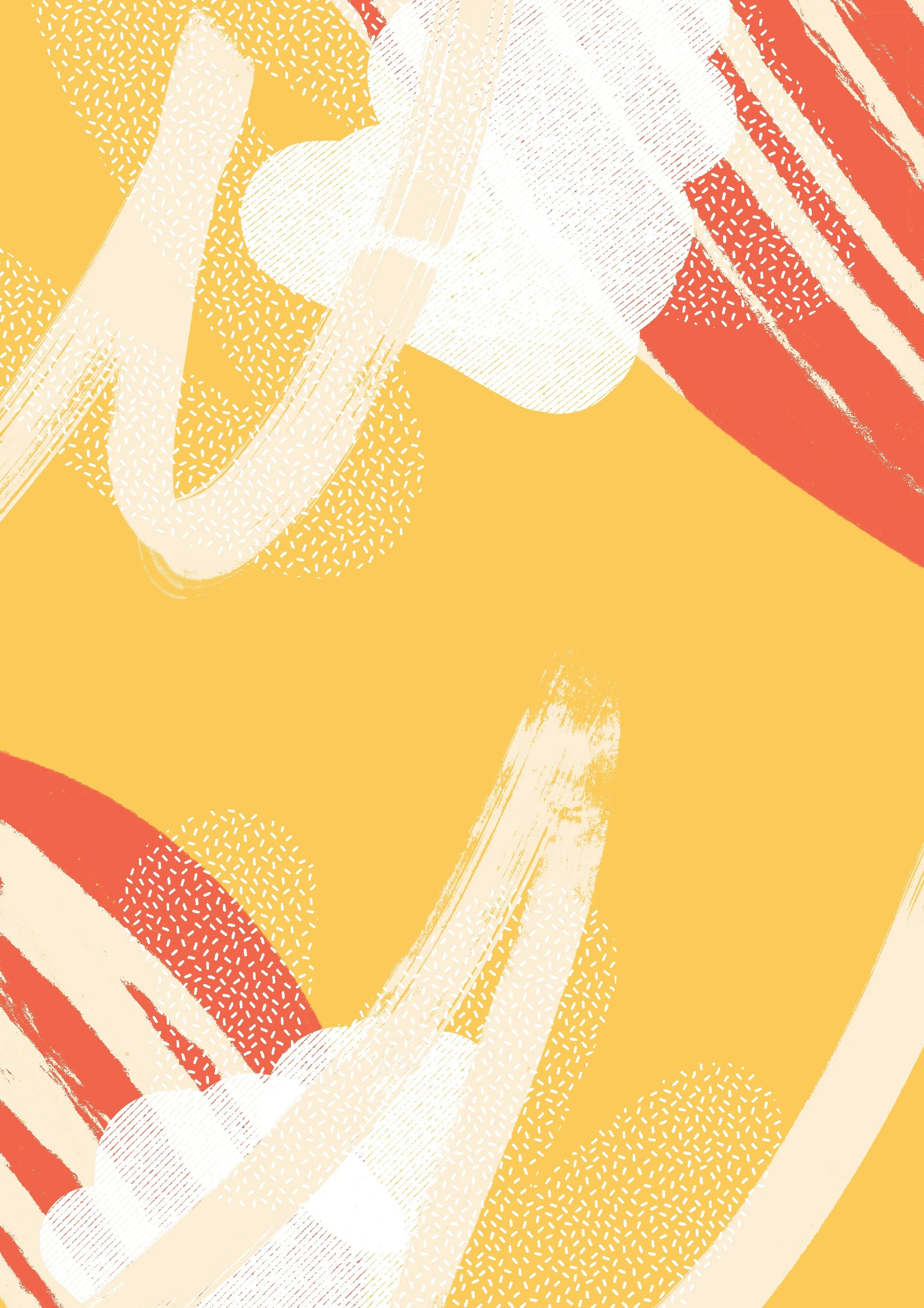
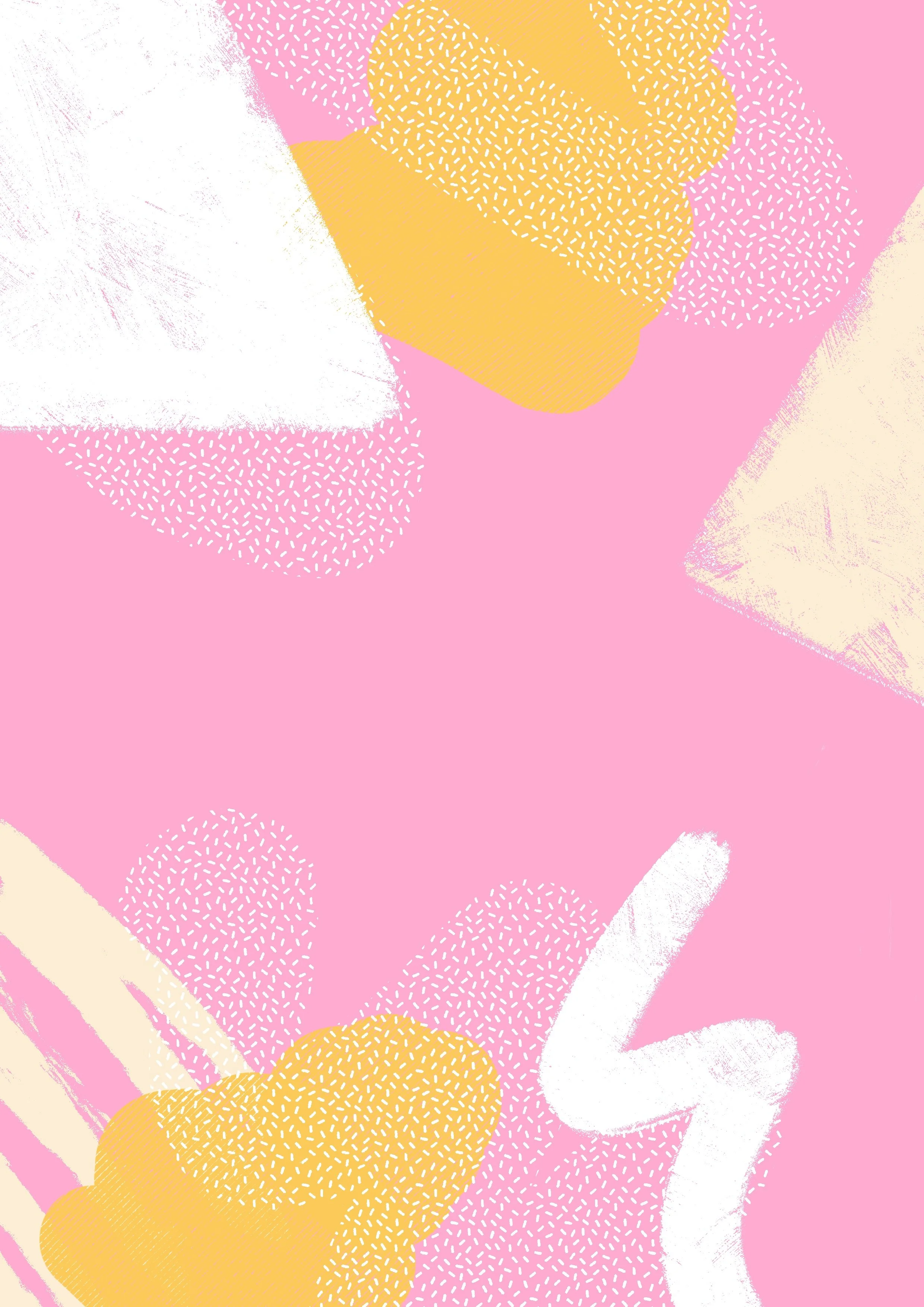
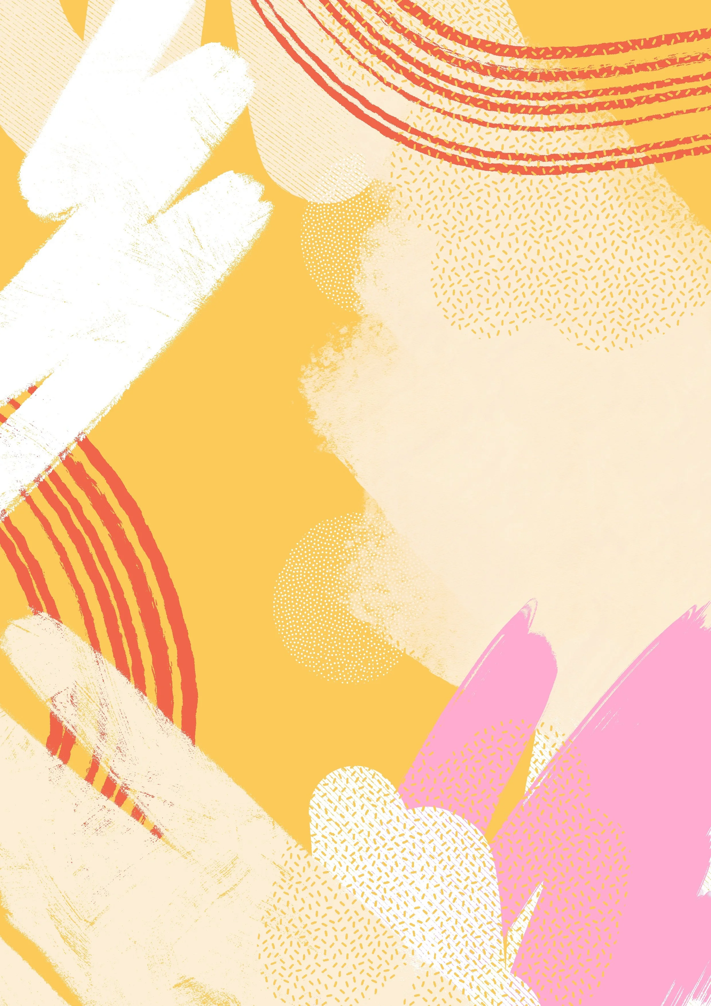
Cancer can be chaos, hope, grief, fight, perspective, and gratitude — sometimes all at once. That emotional duality became the foundation of the brand: a balance between calm and chaos, structure and softness. It needed to hold the real weight of the cancer journey while offering lightness, color, and clarity.
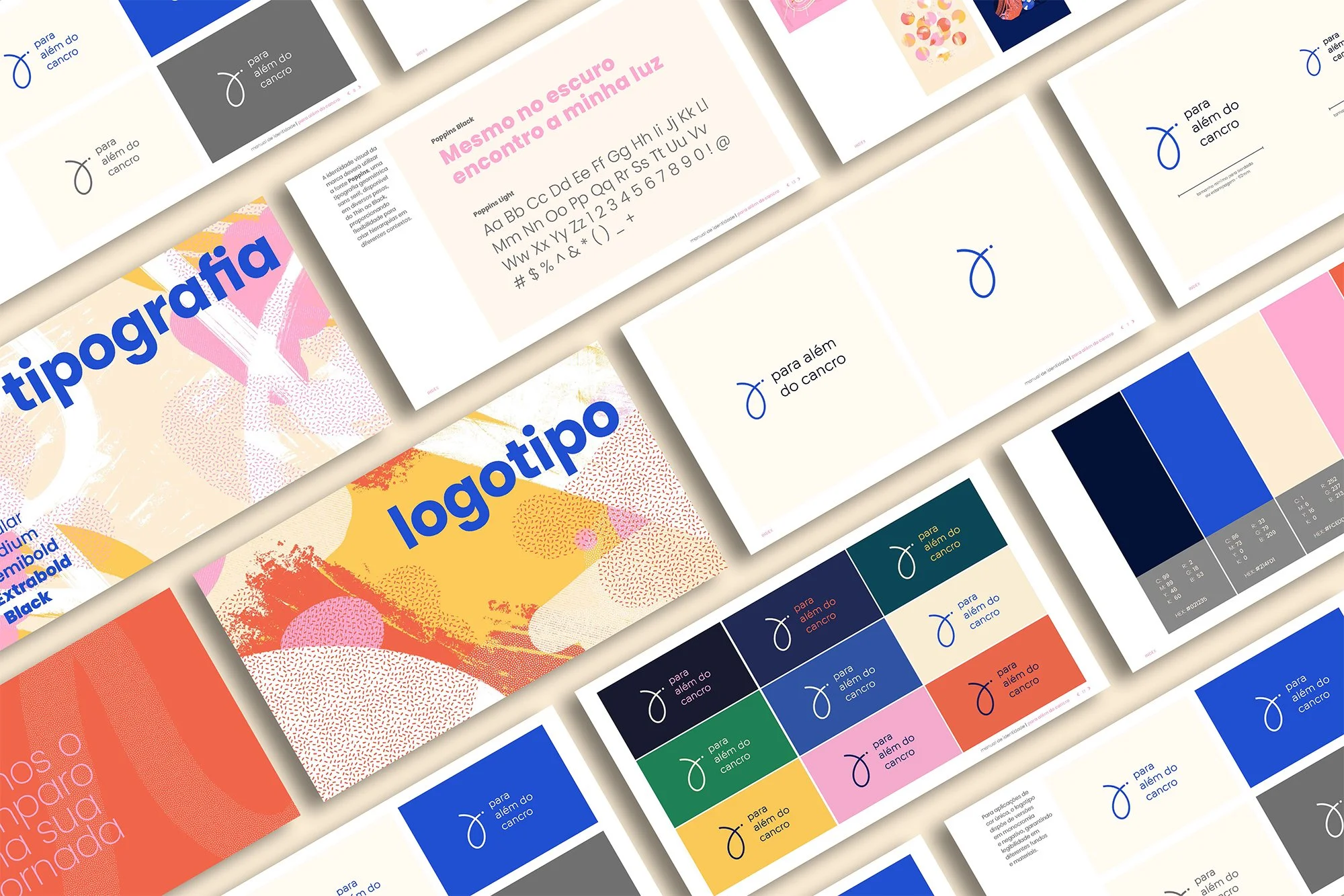
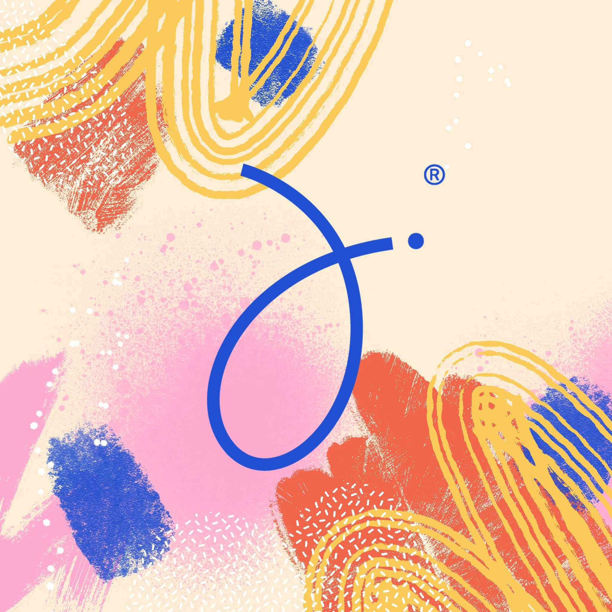
The logo mark reflects that journey — its ups and downs, its moments of limbo, and the quiet fragility that can persist even after treatment. It’s a symbol of continuity, not resolution.
The color system was designed to reach a broad audience — spanning gender, age, and experience — allowing the brand to grow and adapt over time. Typography was kept welcoming and straightforward to ensure accessibility and warmth.
The brand and guide have been praised by healthcare providers, patients, and families for bringing dignity, structure, and emotional support to a profoundly vulnerable moment.
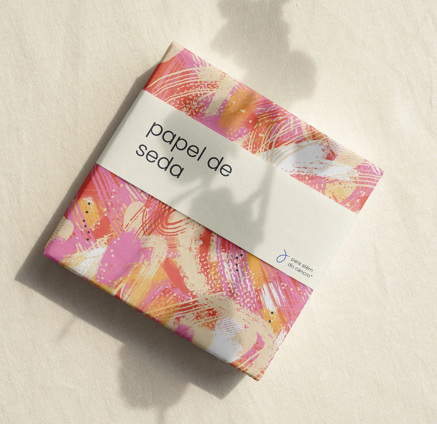
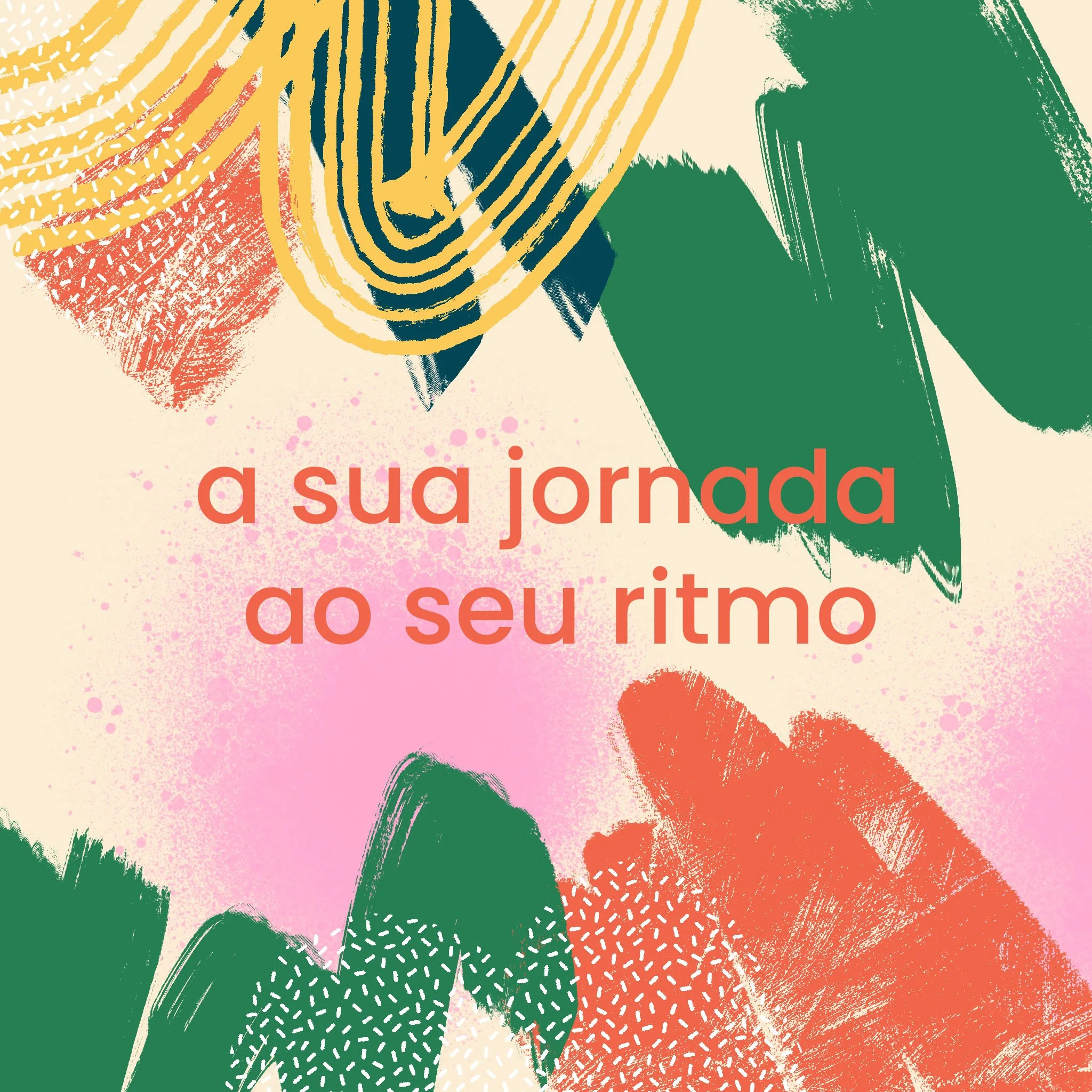
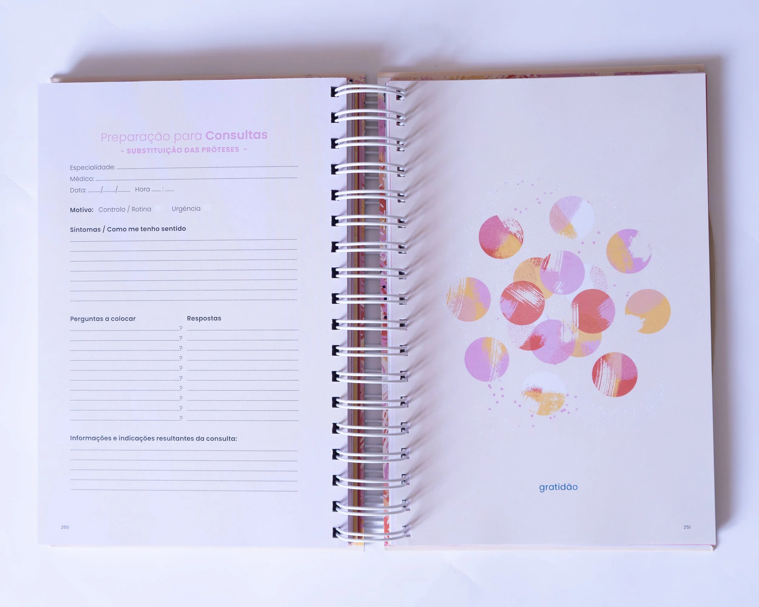
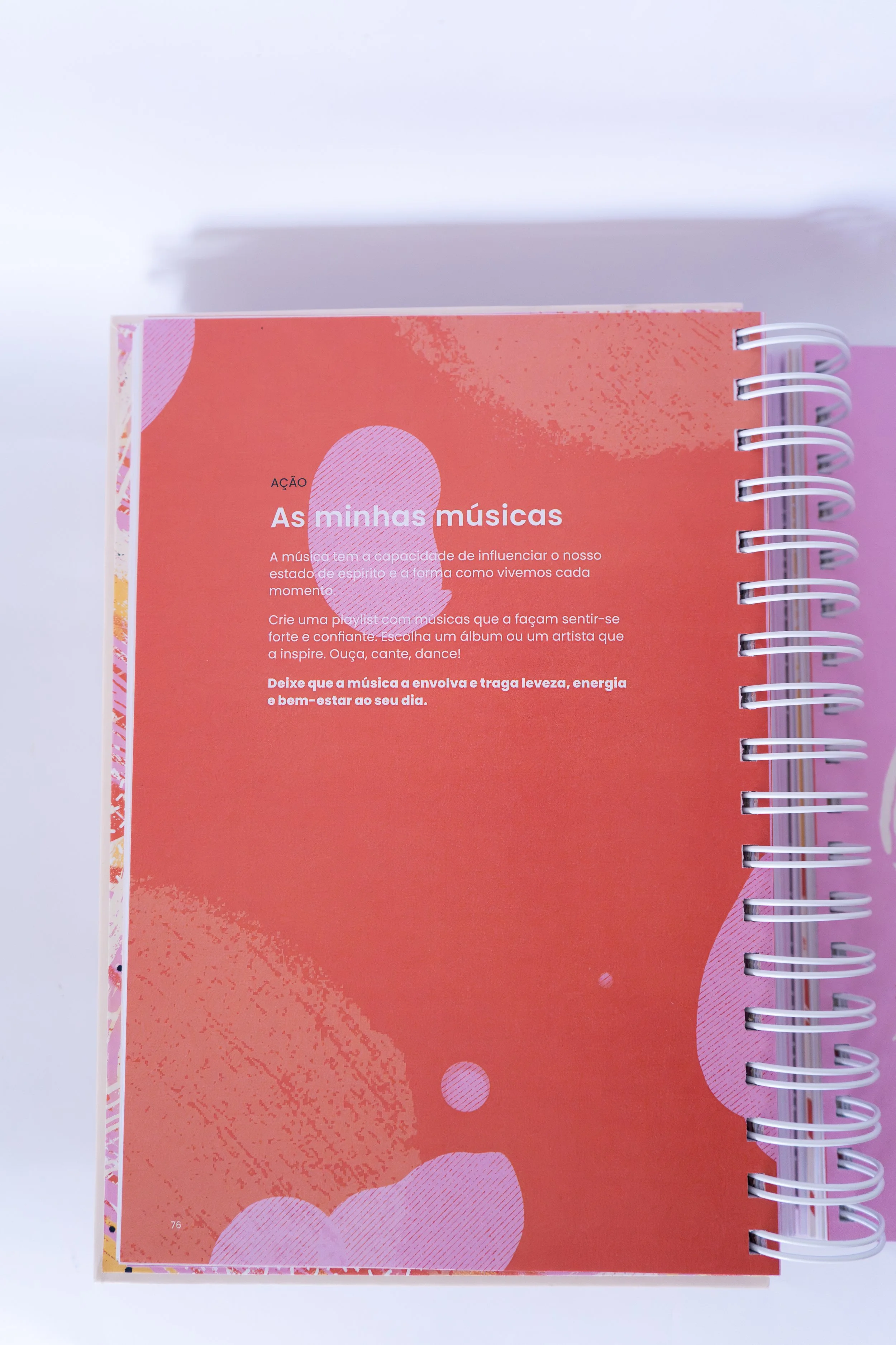
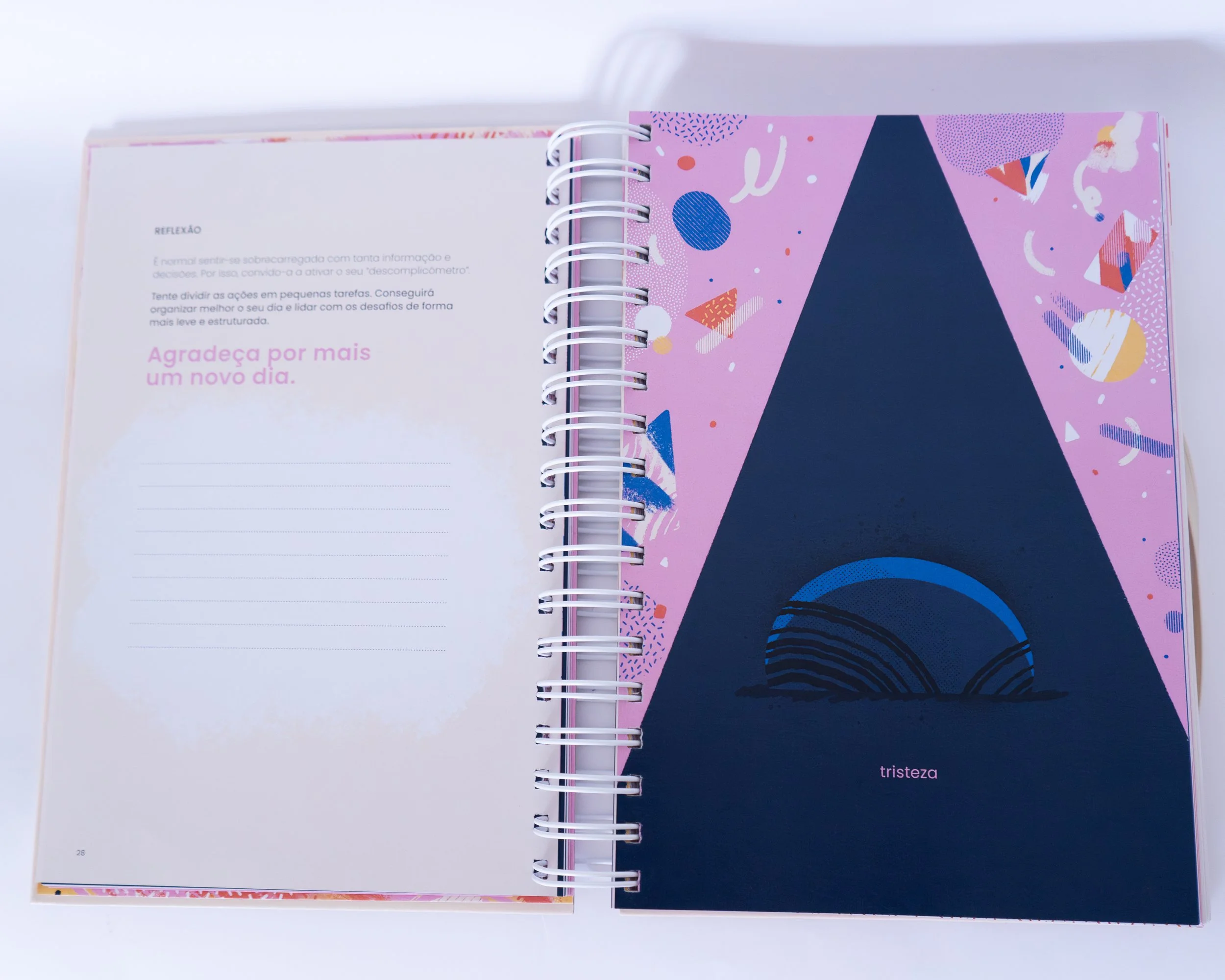
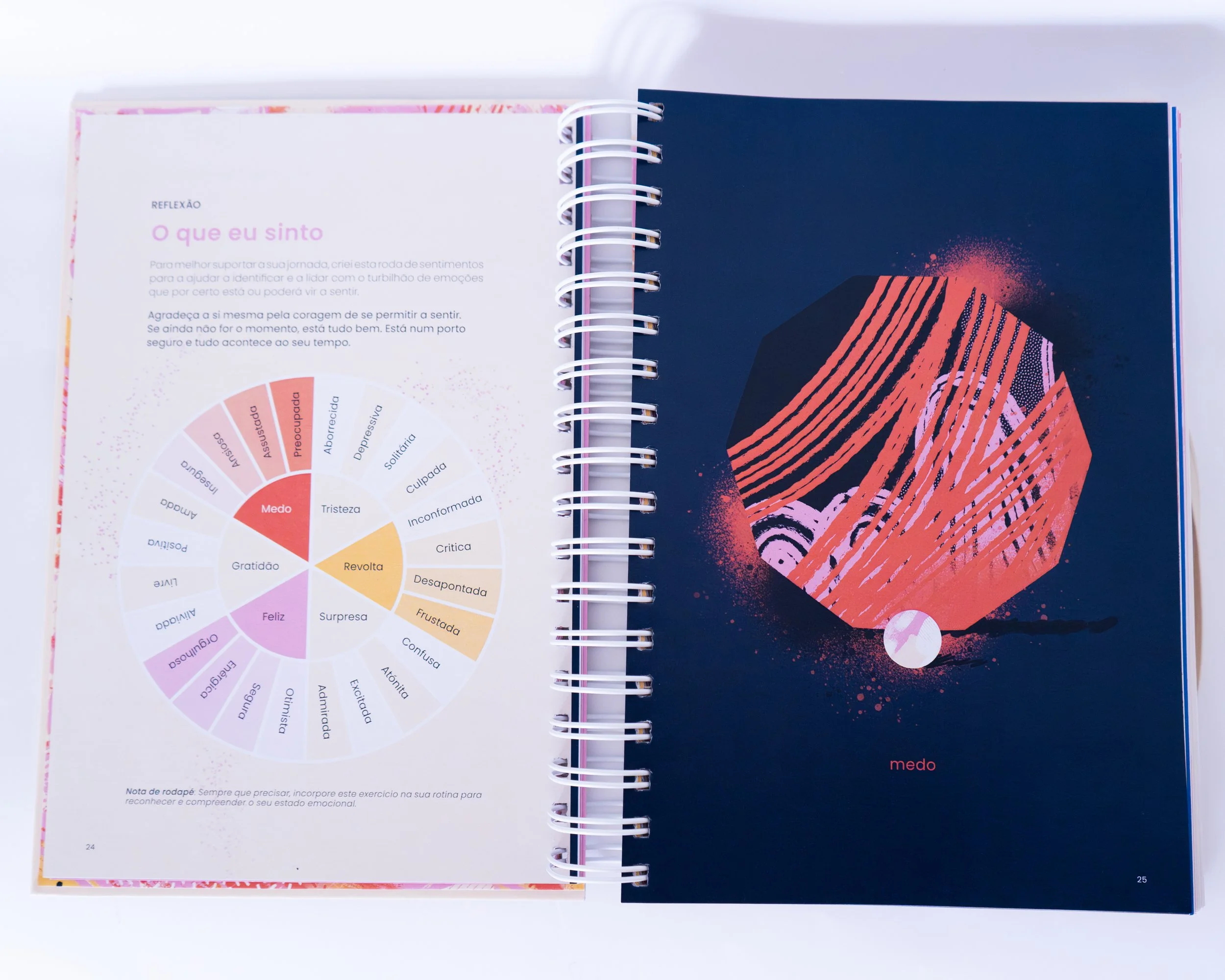
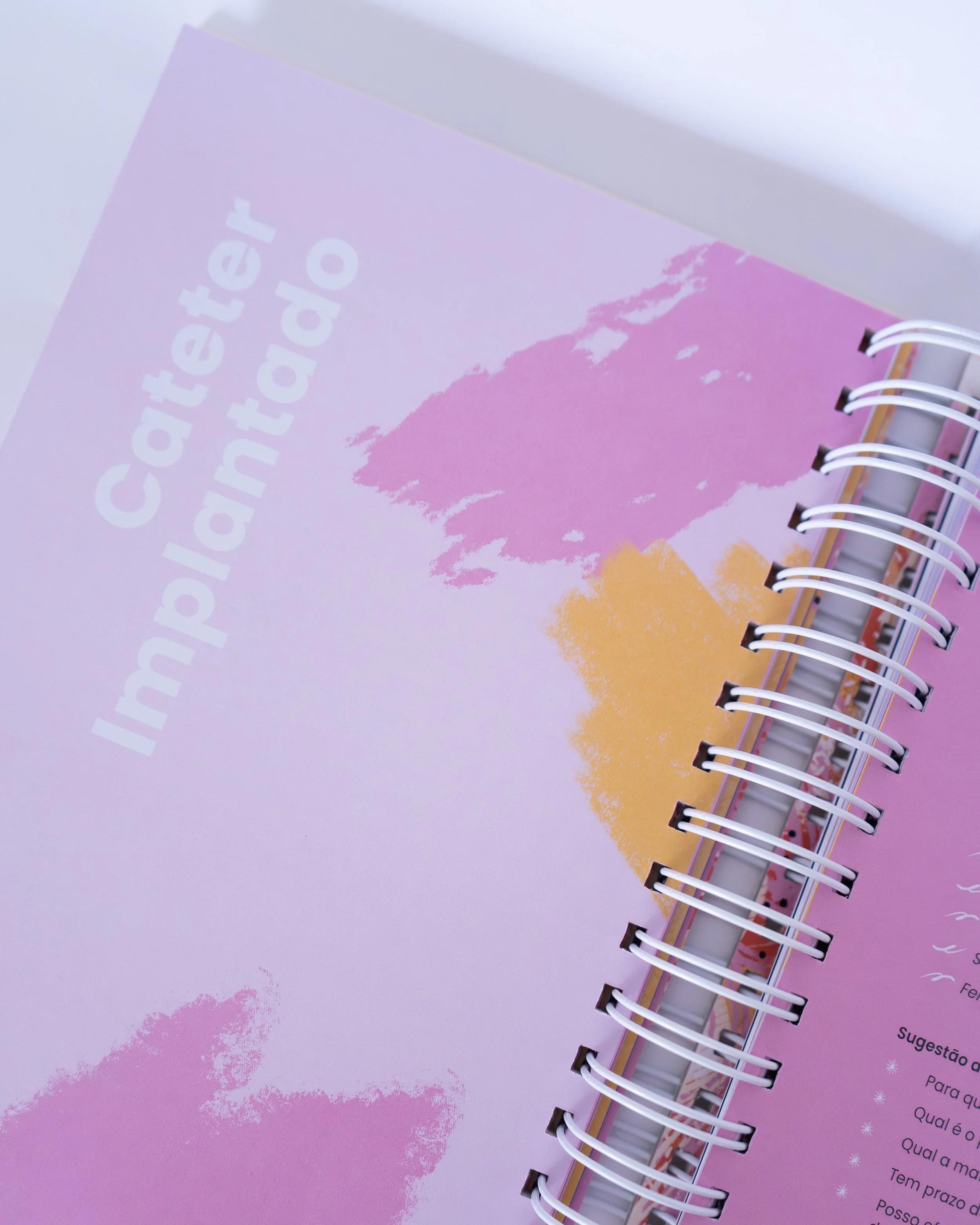
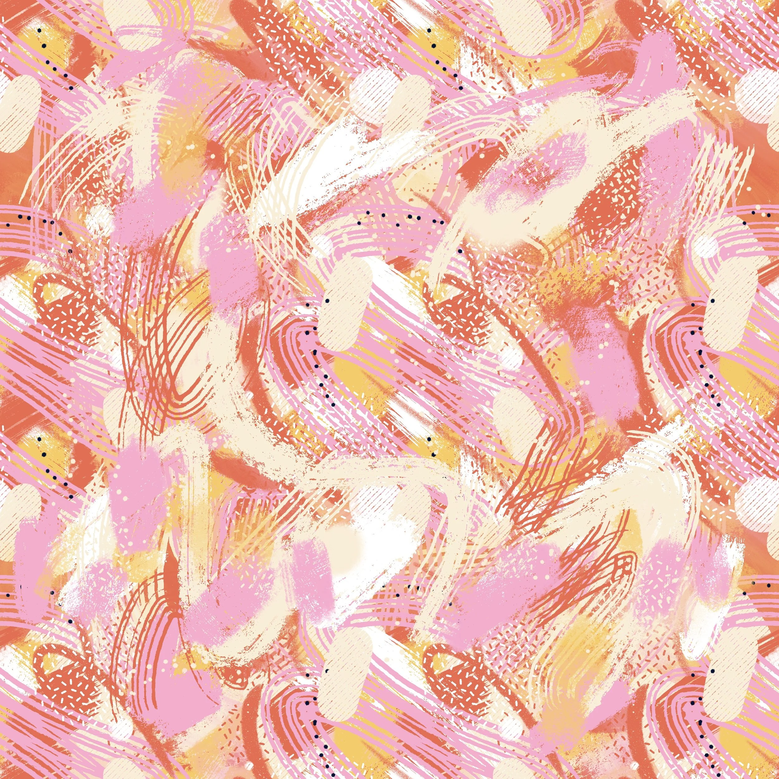
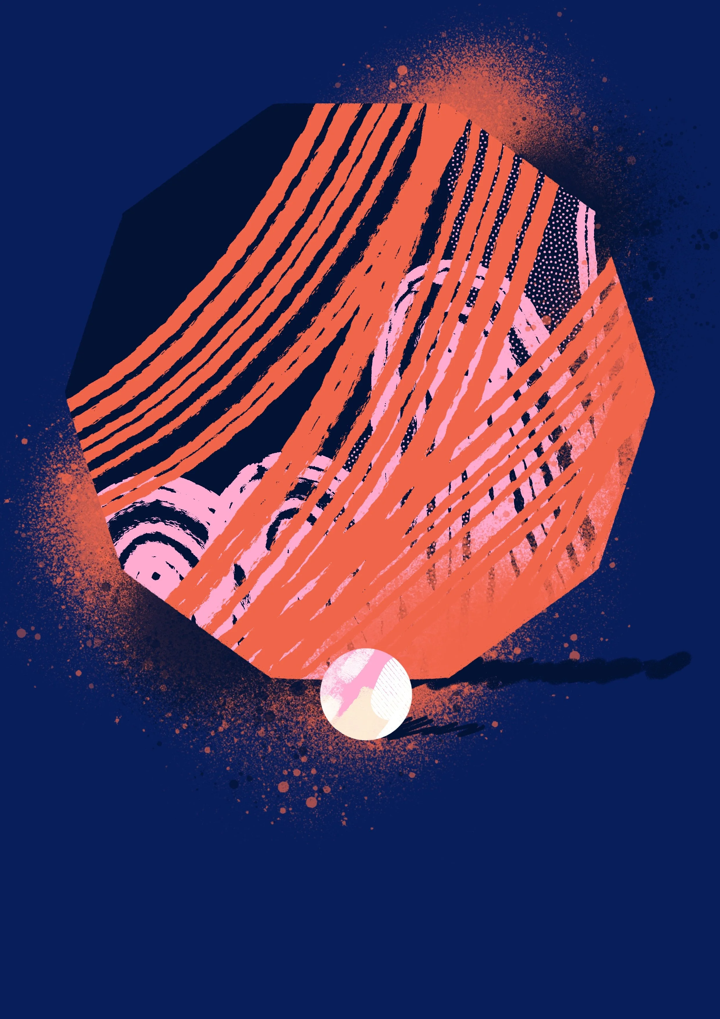
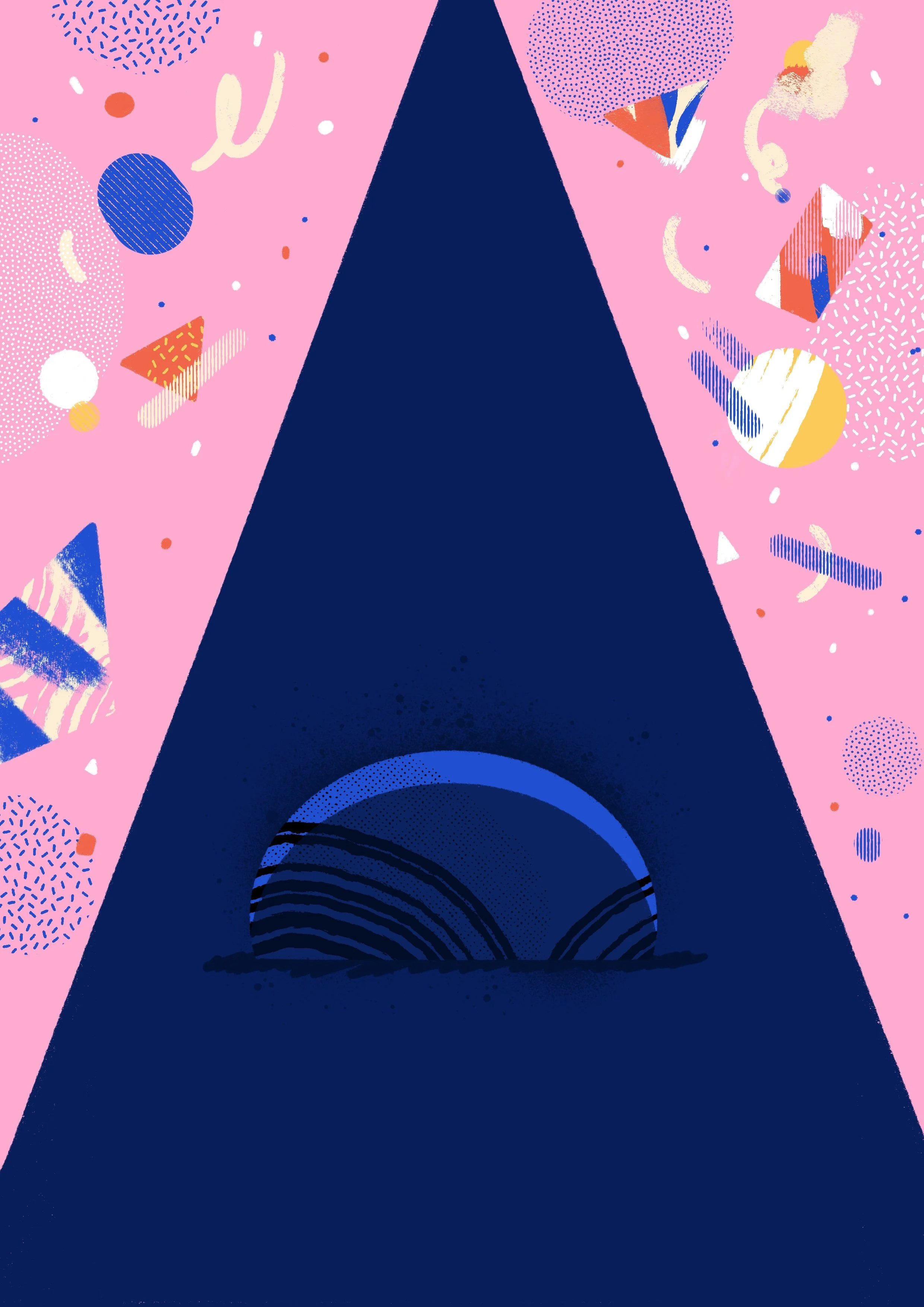
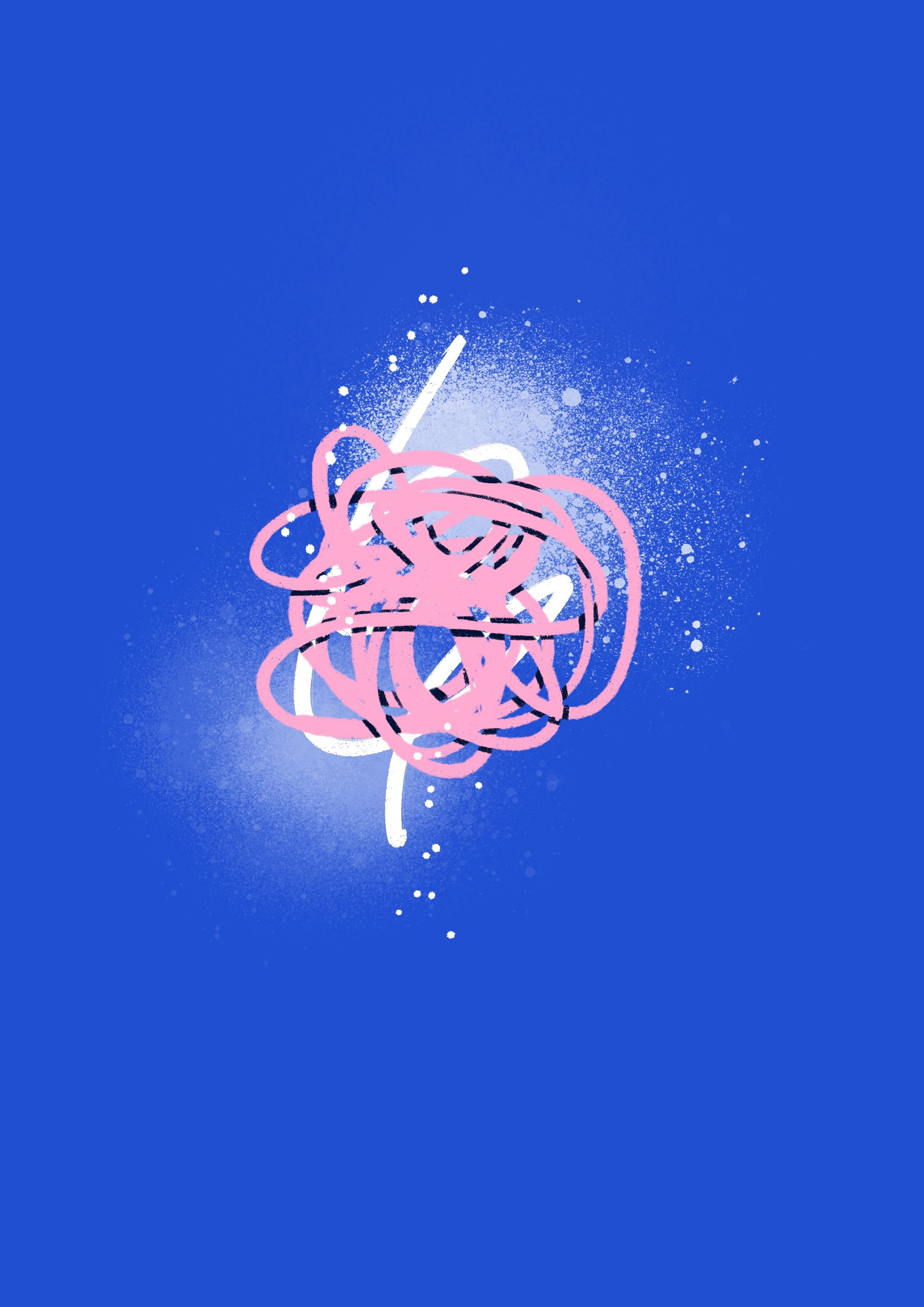
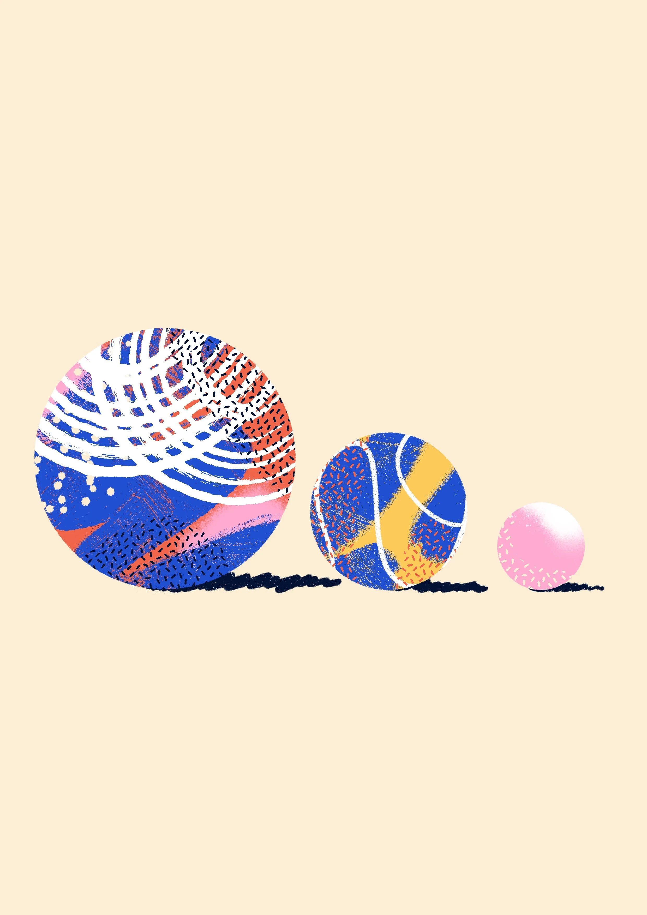
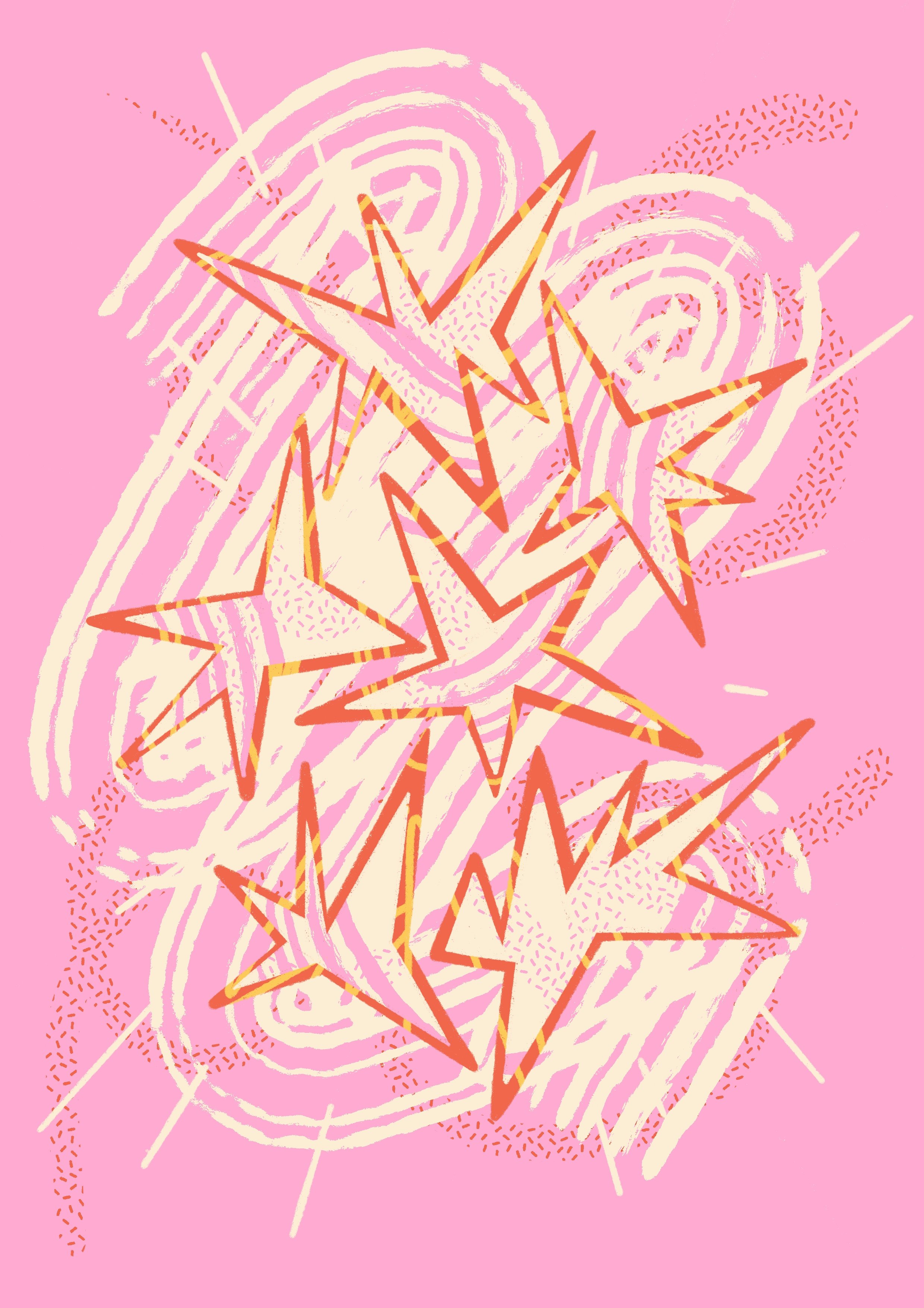
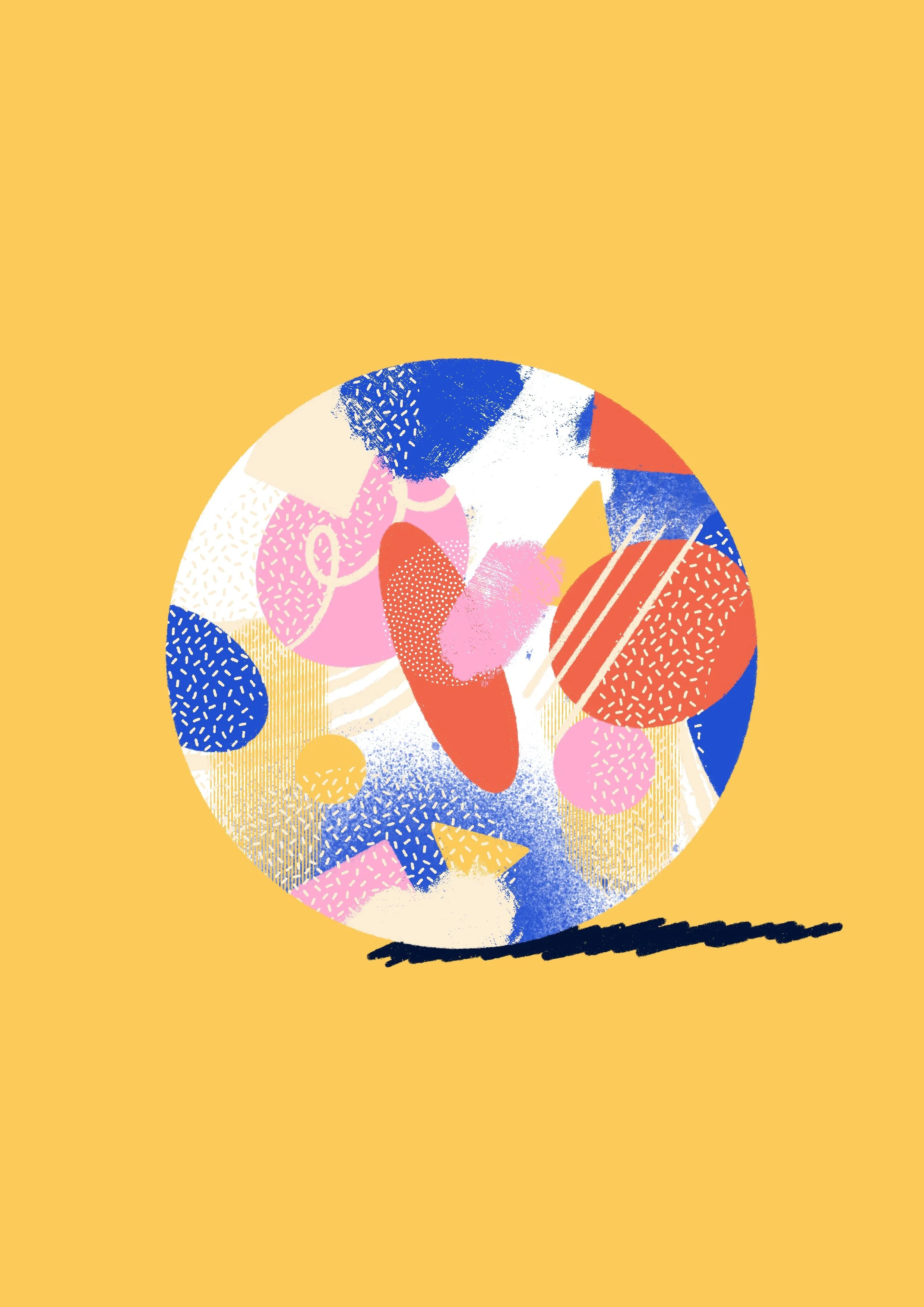
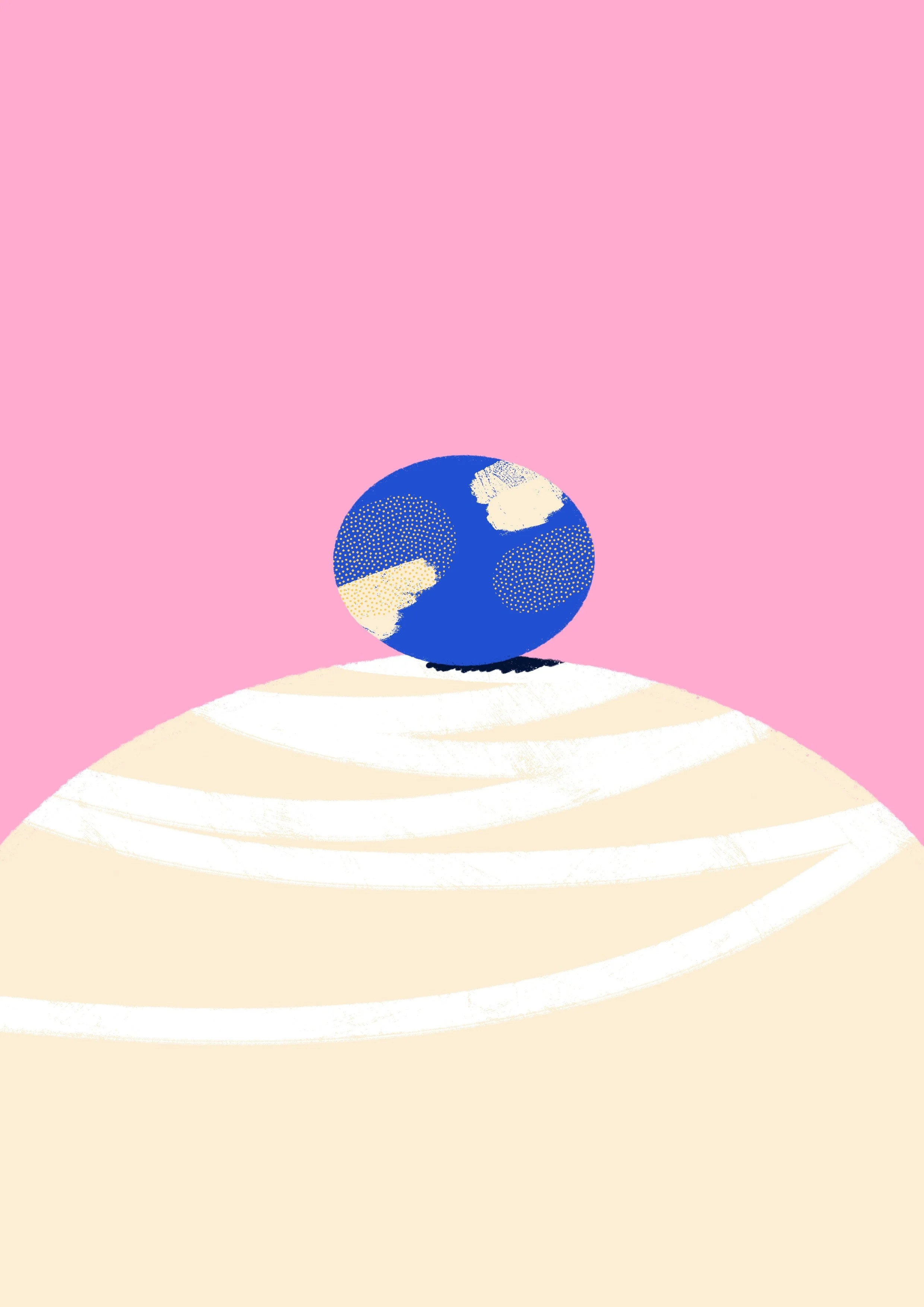
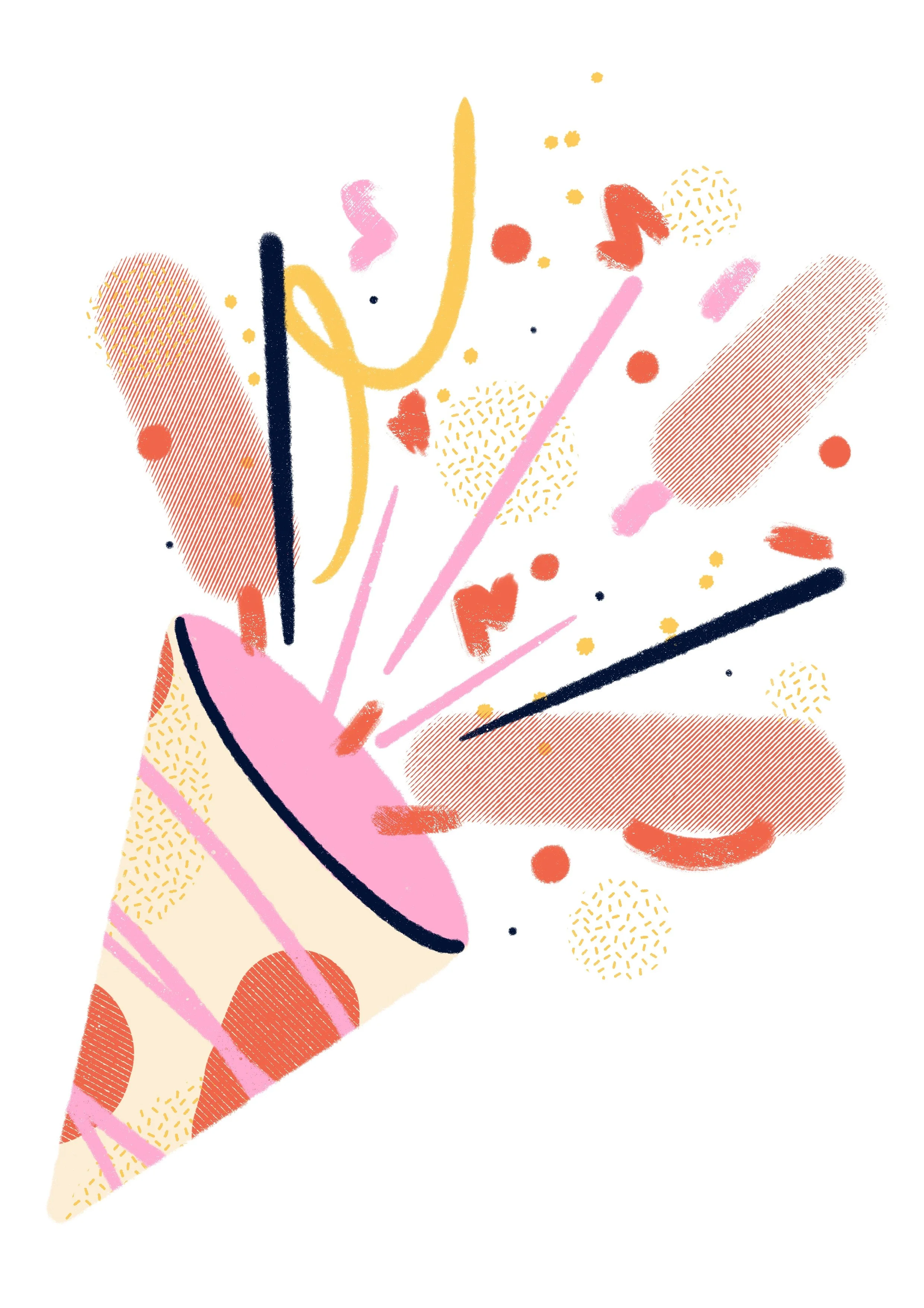
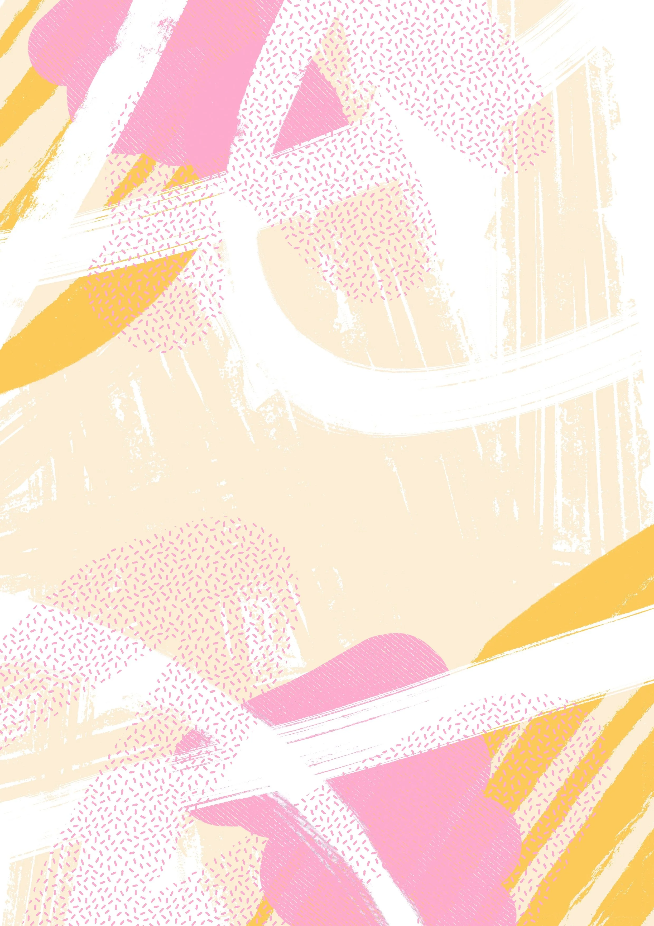
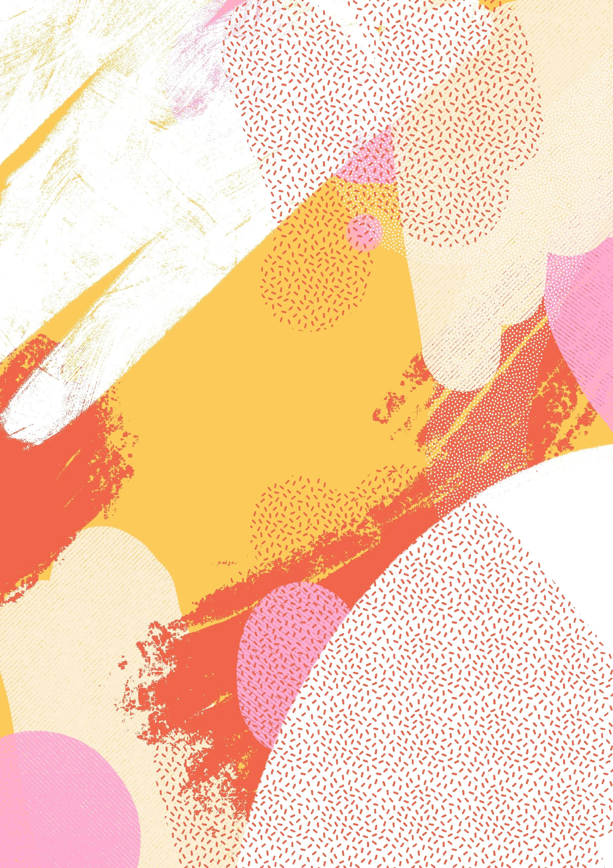
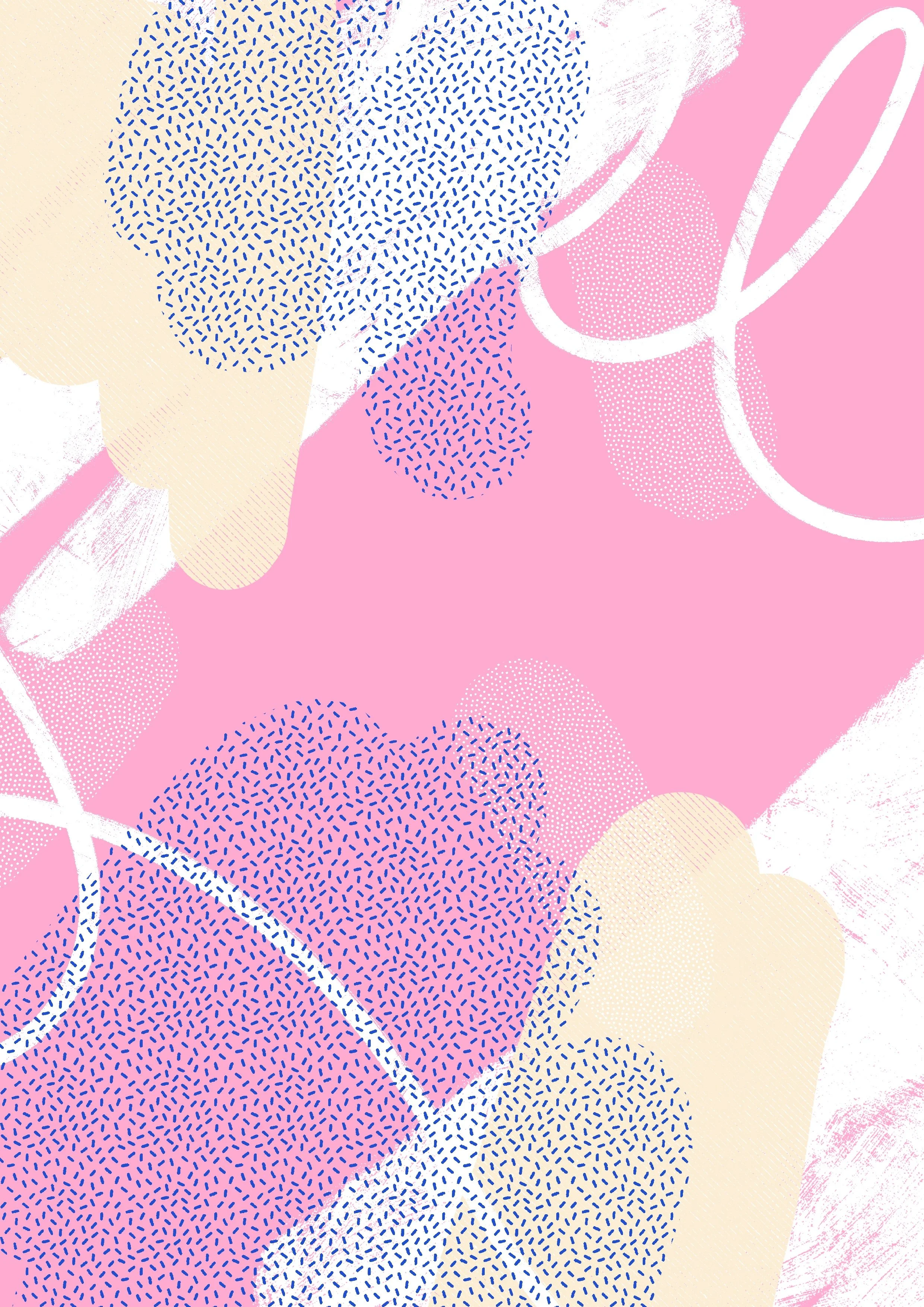
The visual language draws on geometric, abstract compositions to express complex feelings like fear, vulnerability, hope, and more. Each illustration was crafted to invite personal interpretation, giving people space to see themselves. A dedicated illustration and color sequence marked each chapter, making the journey feel as clear, grounded, and soothing as possible.
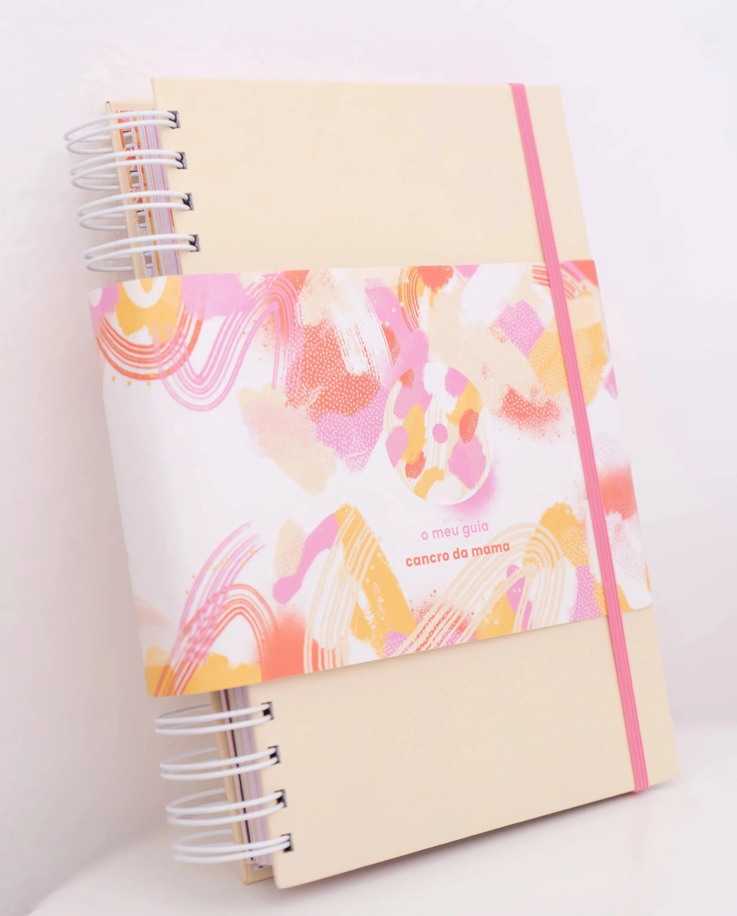
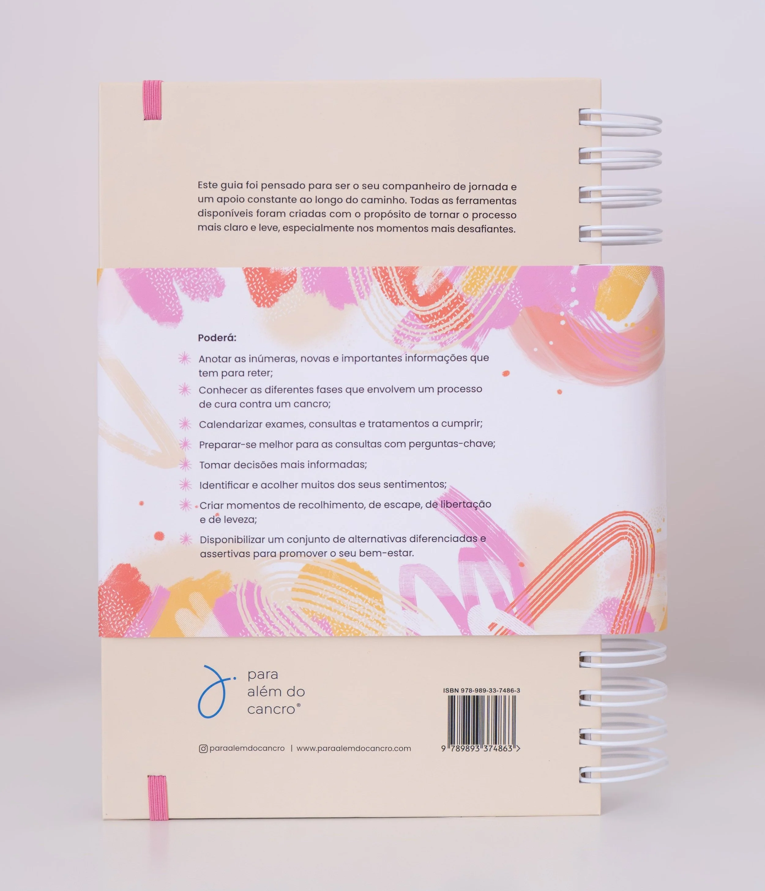
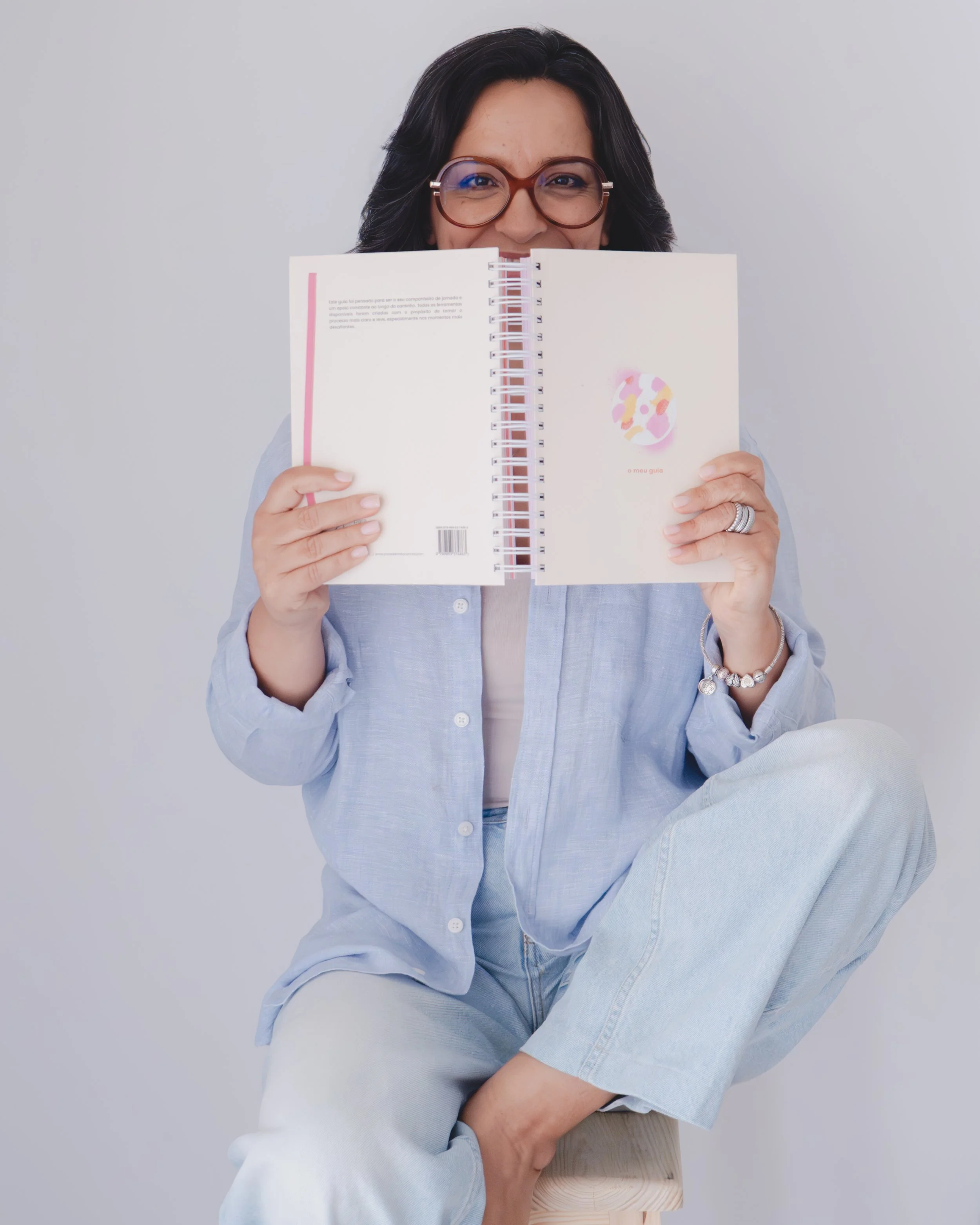
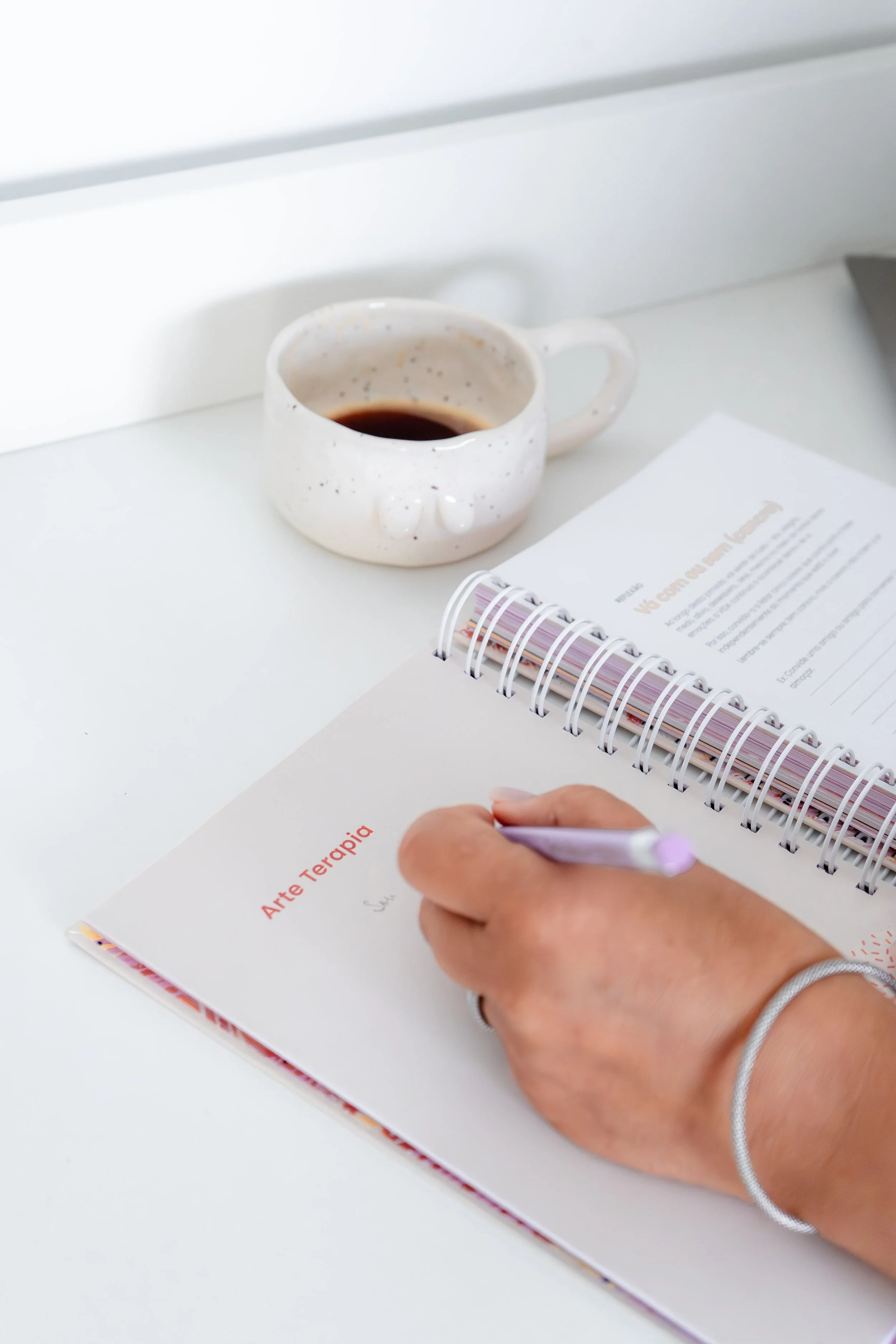
The first guide, A Minha Mama, was created specifically for women with breast cancer. It combines practical medical support with space for emotional reflection — guiding users through both clinical steps and inner moments.
The palette, tone, and illustrated “feelings” were tailored to its audience, with each section introduced by calm, expressive visuals that carry a shared rhythm throughout. The result is an experience that feels consistent, human, and deeply considered.
Feelings and Emotions
-
![]()
Anxiety
-
![]()
Fear
-
![]()
Sadness
-
![]()
Victimization
-
![]()
Relief
-
![]()
Anger
-
![]()
Gratitude
-
![]()
Vulnerability
-
![]()
Acceptance
-
![]()
Hope


Sticker

Sticker

Sticker

Some of the creative team and author behind A Minha Mama.
Credits :
Author: Sandra Matinhos
Copywriting: Maria Eduarda
Design and Cover: Inês Margarida
Layout: Sandrine Boebaert
Illustration: Inês Margarida
Marketing: Joana Jesus
Photography: Joana Jesus
Chapters

Sandra Matinhos
CEO da Para Além do Cancro
Criadora do Guia - A Minha Mama
“You were the central piece, the creative soul who gave color, shape, and life to my humble ideas.”
When I shared with you my first notes and ideas for what I envisioned creating — simple lines written in Word and kept in a drawer for years — I immediately knew I had found the professional I so badly needed to help me develop my “onco agenda.” And at the same time, I know that you, with your more-than-special gift, understood my vision and could already see the full potential of the project!
All that clarity of mind, enthusiasm, and contagious energy you brought were exactly the push I needed to believe and move forward.
Over these past two years, you’ve been so much more than the project manager and illustrator. You were the central piece, the creative soul who gave color, shape, and life to my humble ideas. Your intelligence, creativity, and talent in design and illustration were simply extraordinary.
You are also organized, communicative, assertive, and deeply responsible. You made a commitment and honored it with exceptional rigor and complete dedication. In my view, you are the complete professional everyone should have when developing their projects.
I must also say that this journey together has been enriching in every way, and I am certain that without you this Guide (which is the work of both of us) would never have reached the level of excellence it has today.